8 Techniques for Designing Eye-Catching Headers and Footers with WordPress Elementor

Headers and footers are important elements of any website. They help establish the aesthetic of a page, create navigation paths for users to follow, and even add an extra layer of branding. With WordPress Elementor, it’s easier than ever to design headers and footers that capture attention and keep visitors on your site longer.
Headers technically take a lot of the attention, as they are usually located at the top of a page and provide an introduction to what’s on it. They also present vital information about your brand or company to visitors.
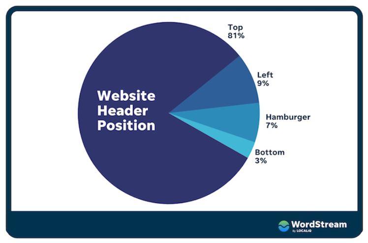
Check out Wordstream’s breakdown of website header position:

Footers, on the other hand, are generally at the bottom of a page. They provide details about website policies and contact information that visitors can find easily.
Here are 8 techniques you can use to design eye-catching headers and footers with WordPress Elementor:
- Use Bright Colors: By choosing colors that stand out and contrast your other page elements, you can create a header and footer that are hard to miss.
- Include Graphics: Do you want to make stronger impressions on your website visitors? Illustrations and graphics added to your header and footer can dramatically elevate the appeal of your page! Everything from letterforms to icons, illustrations act a key component for satisfying any user
By reinforcing your brand identity with appealing visual elements, viewers can stay longer leading to better engagement. It’s an unmistakable fact: statistics show that graphics placed in headers are beneficial no matter type of website. Enhance the effectiveness of your header and footer with striking illustrations and graphics—users will be thankful for it!
- Make Use of Animations: Animations can provide a great opportunity to engage visitors when browsing your website. When added to headers and footers, animations can offer an entertaining experience that helps create stronger engagement with your content. In addition, if used strategically, animations can help draw attention in specific areas of your website while simultaneously elevating the energy level of your online presence.
For example, if you have multiple navigational menus or other relatively static elements that need extra emphasis, using skillful animation techniques may be a perfect solution for directing people’s attention exactly where you’d like it to go. Through this combination of simplicity and subtlety, a tasteful use of animation in your header and footer designs can allow the user to gracefully discover the essential information enabling them to stay attuned with the context of the content they are viewing.
- Use White Space: A well-designed header and footer require a balance of elements and white spaces. Leaving some space between them creates separation that makes it easier for users to find what they’re looking for more quickly and efficiently.
Creating balance in the design of headers and footers with elements and white space is an essential part of contextualizing website design. The strategic use of white space grants clarity to a page’s construction which allows for easier navigation and minimized cognitive load.
Additionally, leaving a degree of distance between text, images, sections and headers can help readers keep their eyes on the task of seeking what they need. Consequently, careful consideration should be exercised when utilizing recommended formats when releasing work as these do work to reduce overwhelming frustration experienced while searching through detailed information quickly and efficiently.
- Utilize Typography: Fonts are an essential part of crafting any web page. Since both headers and footers represent substantial parts of your website, you need to select fonts that capture the feelings and sentiments you want to convey to visitors.
When selecting a font, it’s important to consider readability. For instance, if you want to emphasize important information, choose a font that looks professional and reflects your brand values. If you’re going for a casual look, try using hand-written fonts or a more modern typeface.
In addition to readability, fonts can also add visual interest to your page. Experiment with different combinations of different weights and sizes to create unique visuals in your header and footer.
- Leverage Logo Design: Using the right type of logo can really help in creating a memorable header or footer design. Logos have to be eye-catching yet meaningful, conveying the core values of your brand while being visually appealing to visitors.
If you’re designing a header or footer for your website, consider adding a logo to either or both in order to create an easy-to-recognize visual cue that visitors can connect with. This will instantly give your page a professional look and help you establish authority for your brand.
- Utilize Shapes: In many cases, using shapes instead of images or graphics can be just as effective when creating a header or footer. Shapes are incredibly versatile and can be used to emphasize text, direct attention to specific sections of the page, or just add visual interest.
For instance, you could use different colors and shapes with the same style (such as circles) throughout your header and footer designs to create a visually cohesive experience for your visitors. This can help add a degree of sophistication to your website and make it much more engaging for visitors.
- Utilize Position Stats: Elementor has some great features that allow you to adjust the position of headers and footers in relation to the rest of your page. This allows you to create a custom design where elements are placed exactly where you want them, giving you more control over the look and feel of your website – something that can be incredibly helpful when creating a strong page experience.
For example, if you want to add emphasis to certain page elements, adjusting the position stats for headers and footers can help you make sure they stand out from the rest of the content. This is a great way to create an eye-catching look for your website that will make it easier for visitors to find what they’re looking for.
By taking advantage of the features available in Elementor, you can create a powerful header and footer design that will draw users in and keep them engaged with your content. Implementing these design tips can help you create an effective page experience that will help you achieve your goals. By taking the time to carefully consider and implement these design tips, you can create a powerful header and footer that will captivate visitors and make them stick around for longer.