Web Design Trends for 2016
In the web development industry, design trends change on a regular basis; patterns innovate, color scheme preferences adjust, new fonts are created, and designers change their perspective. 2015 has been an interesting year for web development, but 2016 will be a big leap. In line with this, we decided to share some of our insights on where web design is headed. Though these are just our predictions, use these guidelines to make sure your website future-proof.
-
Flexbox coming out of its shell
Modern browsers support for CSS3 has steadily shown growth over the past couple of years and is already reaching the point where the latest CSS3 modules are available in major browsers like FireFox, Chrome, Safari and Internet Explorer. Layout paradigms will not change drastically using CSS3 but it will give easier solutions to web developers on mapping out their designs that they want to portray in your website, one example of which is the Flexbox or what they called Flexible Box layout which could make more creative layouts.
Using Flexbox equates to a more efficient CSS implementation, insignificant need to create work around codes or hack codes, and it would quickly respond to browser changes, therefore, making rendering of websites more responsive and faster without using the any grid systems.
Here are a few examples of websites utilizing Flexbox
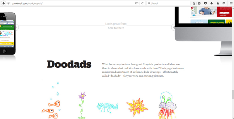
Dan Mall use’s pinned layout in this section of their website; space-between properties now possible with flexbox.
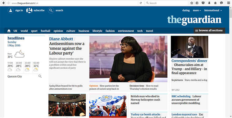
Newspaper layout; The ability to re-order and set alignment to the desired preference is made easy using Flexbox.
-
Focus on Typography
Typography’s accessibility has become more momentous for us all. There are several websites which offer a lot of font options for us web developers to use, and as a result, we can design more creative layouts using an assortment of font styles. It’s a small and difficult change but it will give drastic enhancement to one’s layouts, think of it like it’s an outfit to wear; you would always think of what people may say on what you are wearing, people might give a write or wrong assumption of what you want to imply because of what you chosen. Gone are the days where we save fonts as images, now, we can embed fonts directly in the website.
Here are a couple of websites which you can get fonts from.
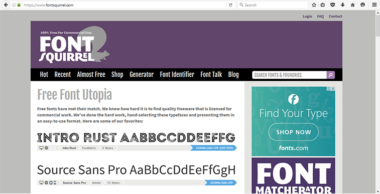
Font Squirrel
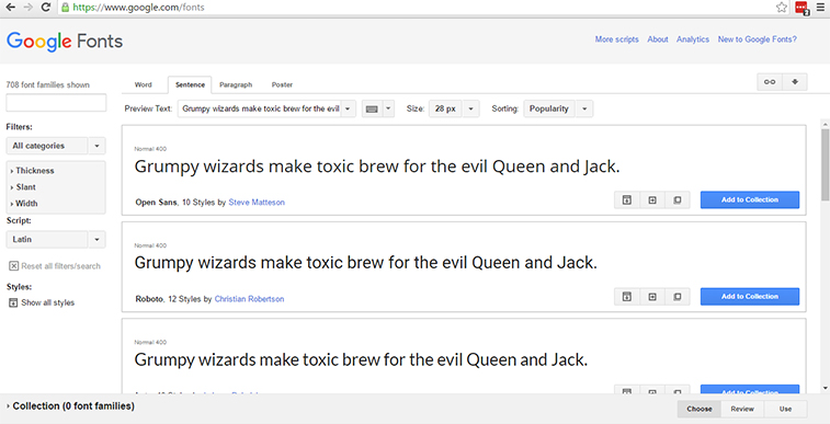
Google Font
-
Fearless Colors
You cannot design a website without using colors. Colors dictate the feel and theme of a website, even the famous black and white pallet has different options for hue, contrast and balance. Color has remained on the down-low in 2015, but now, brands are becoming bolder in terms of color palette choices. 2016 will be marked with a whole lot of colors, alongside with the growth of fonts and appreciation of typography.
Here are some websites with fearless colors
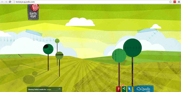
Toris Eye
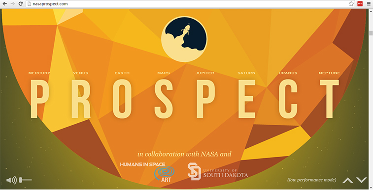
Nasa Project
- Material Design by Google
Flat designs, bolder colors, and subtle shadows; these are the essential components of Material Design. Google has developed this type design language which consists of specifications for a unified system of visual, motion, and interaction which adapts across different devices and different screen sizes.The advantages of using the Material Design frameworks is that you could give emphasis to 3D elements on your designs which entices users click or navigate, making it more attractive and useful. The greatest advantage of using Google’s Material Design is that it’s a framework that is ready-to-use out of the box, which frees you from building your work from scratch. Google starts a lot of trends and a lot of people look up to them.
Google’s Material Design are implemented in these websites
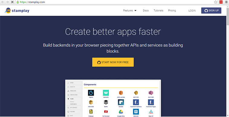
Stamplay
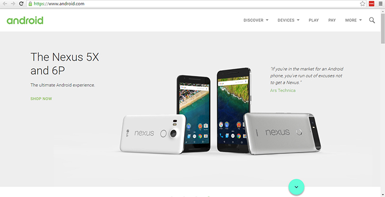
Android
-
From small scale animations to Large scale Animations
Animations are being utilized increasingly to improve a site’s narrating, making the experience more interactive and captivating. However, you can’t simply stick animations at anyplace. Always put into consideration whether its placement adds to your site’s value and identity.
Significant changes would be visible in terms of website animations due to the CSS animation support from modern browsers. We strongly predict that website animations will be widely used in 2016. Expect to see more parallax, split designs and pop-up screens on newly developed websites.
Want to see websites with great animations? Check these out.
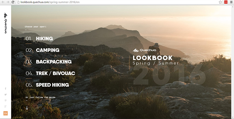
Quechua Lookbook Spring Summer 2016
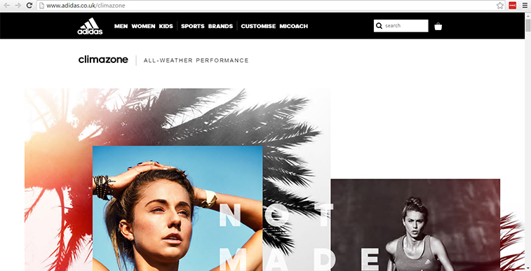
Adidas Climachill
-
Single and long page designs
Single Page websites have been around for several years. Be that as it may, we can anticipate that it will still stay in trend little bit longer. This is widely used as “Landing Pages” for PPC campaigns because this type of sites are faster to design and code, doesn’t require a complex structure, and mainly focus on Call-To-Action elements and conversion. Due to the increasing amount of mobile users on the past few years, several UI/UX studies have shown that users do not navigate to inner pages anymore, instead, they look at details on the first fold or first page of the website rather than navigating the entire site, that’s how this style of design became a trend.
Furthermore, new long page designs now practice a more user-friendly and dynamic approach. Rather than just focusing on conversion and clicks, it is now generally used to tell a story and engage users to the design. This technique has a lot of haters, but as well as followers (me being the later).
Here are a couple of good examples of a single or long page designs.
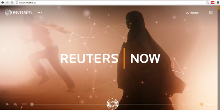
Reuters TV
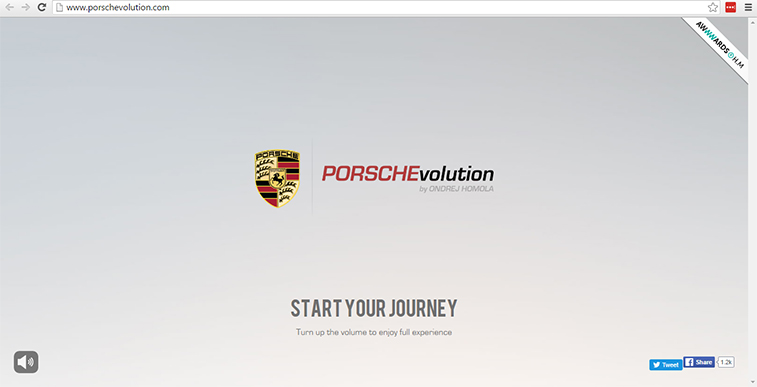
Porsche Evolution
-
Menu Structure – More Hamburgers or Navicon Menus
With the wide array of mobile devices that are used for internet browsing, focus on mobile-friendly and responsive navigation became an issue. “Hamburger” or “Navicon” menu is the best solution as of today, despite the fact that many of designers argue against it in desktop versions of a website, the three-bar icon wins as an alternative solution in the responsive web landscape. Furthermore, it seems that we would be seeing more and more of it in the nearest future.
Implementation of a “Hamburger” Menu or “Navicon” would still depend on the niche of the website, though it gives option to a more stylish, yet simple mobile inspired three-line icon that looks sleek and subtle in most of the design environment, we still have to make sure it is appropriate for our web design clients. This simple symbol can be utilized to conceal unpredictable, content-overwhelming menus.
Here are a few sample websites who creatively used Navicon Menus.
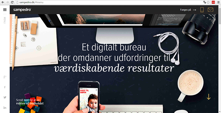
Sampedro
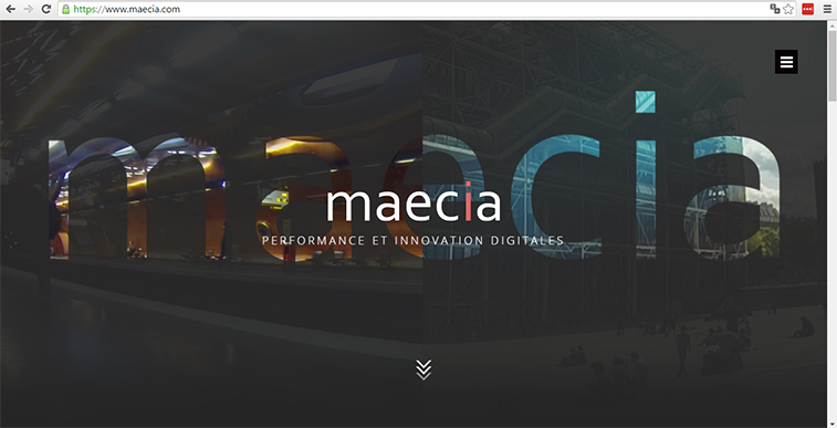
Maecia
To sum it all up…
Pay special attention to imaginative treatments showing up throughout the web, not only in incidental features but in huge, strong and sleek approach on designs. Right or wrong, the seven items I enumerated above are my expectations for the future of web design.
It’s exciting to see the present styles of 2015, but honestly 2016 will impact a major change and a walk forward into portability and intuitiveness.
Where do you see web design heading in 2017? Let me know in the comment section below!