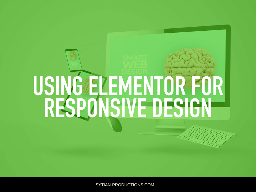
Using Elementor for Responsive Design
Creating a website is challenging on its own and once you finish your desktop version the challenge is to make the website functional and still aesthetically pleasing in mobile mode. It is easy to jumble everything up and mess the whole layout and look of your website when you suddenly switch to mobile unprepared.
If you try to switch it suddenly you will notice that your buttons are too big, headlines are cut, columns are scrolling endlessly, and more! It is very difficult to scratch everything up to make another version just for the sake of catering to different devices.
It is also impossible to create a website without worrying about the mobile version because everybody is on their phones nowadays. It is not advisable to neglect the mobile version because people will go to your website using their mobile phones whether you like it or not so it is better to be prepared for those site visitors.
Making your website look perfect on different devices is a big challenge that all developers and website owners face. It is very frustrating because it affects not just very decorated and complicated websites, but even simple websites.
It does not mean that when you buy a theme that looks good on the mobile mockup of the website it will look exactly as perfect as it is. It will definitely break on the mobile version if you do not fix it.
If you have a reliable professional web designer then they will take care of the mobile responsiveness of your website and use CSS to dictate how your website will look and behave on mobile.
But if you do not have a professional web designer at your disposal, or you want to try your hand at designing your own website, then you might think you need to learn to code yourself. Despite the laborious process of customizing the website and adapting it into the mobile version, there is a solution that could make your life a breeze, and the best thing is it is free!
A Responsive Solution
If you haven’t heard or tried Elementor then you are missing out a lot! Elementor is a great tool that can solve all of your problems! Elementor works terrifically with WordPress and offers ease of use for especially for people who are not keen on coding.
Coding is not for everyone, especially if you are just trying to make a simple landing page or a blog. That is why people kept searching for the most convenient page builder that could help them make websites without having a college degree in coding.
Elementor offers a drag and drop system that allows users, web designers, and developers to just drag all the elements they need on-screen and arrange each just by dragging.
Now Elementor aims to be an all-in-one solution for all your website needs and the Elementor team have outdone themselves with their Mobile Editing option.
Typography on Mobile
Typography in your website can be tricky and it is very common that texts are misplaced and jumbled with images and other elements of your website. The great thing about Elementor Mobile Editor is that it solves this problem by giving you the control to edit the typography on the desktop and the mobile separately. You can set your font size and other typography settings like letter spacing and line height on mobile without jeopardizing your settings on the desktop version of your website.
Space generously
Yoni Luksenberg, Elementor’s CEO tipped Elementor’s user that it is best to space generously between the different elements on your page. It is easy to overdo the size of the elements that is why it is better to space generously. The spacing can easily change when you move from one device to another, and not all mobile phones are made the same, some would be smaller and some can translate web designs differently than others.
Padding and margin are something you should keep in mind when placing your elements on your mobile page and when sizing. You can appreciate your web design more when you can see the entire picture rather than having all the elements zoomed in.
Alignments on Mobile
Mobile versions also have plenty of alignment problems that could make some of your columns disappear, be cut off, or be switched. This could be a big problem especially if your elements include images covering your texts. With Elementor you can now be free to adjust alignment as you feel the need to. Chances are you might feel like sticking to the center all the time, but with the Elementor’s Mobile Editor you can be free to use other alignments other than centering all your elements.
Ordering of Columns
Columns, just like mentioned above have a terrible problem with overlapping on mobile. With mobile editing, you can set which sits on top of the other. Even if your image and text columns have a different order with your desktop version you can totally change it with the mobile version with the mobile editor.
Why should you use Elementor’s Mobile Editor for your mobile website?
When you are done fixing and editing your website’s desktop mode it is very likely that your website will have some problems with its mobile version. Now you have a convenient and very visual tool to fix it without knowing any coding.
It is very easy to switch from mobile mode to desktop mode with just one click and edit it just as easily. Now here are some points you have to consider when editing the website mode.
Check your elements if there is enough spacing in between each one as well as on the sides. Also, check if there are elements you have on the desktop version that is relatively big, chances are it will be much bigger on the mobile version. Do not forget to adjust the alignment as well as the ordering of elements like your columns, images, typography, and widgets.