The Proper Way to Do Minimalist Web Design
However, it’s not only about simply putting only the essential elements in the web page and calling it a day. There’s a method in making them stand out and look good as well. There are principles to properly applying minimalism in web design in order to create an amazing website.
Studies show that it only takes five seconds to grab people’s attention. If you don’t get their attention within that time, you’ve lost them. Applying minimalism in your web design increases your chances in getting people’s attention in those five seconds.
The Reason for Minimalism
Minimalism is often confused with mere simplicity, but it’s actually more than that. The concept of minimalism involves reducing all other elements to only include those that are absolutely essential for the website.
While minimalism is indeed simple, simplicity alone doesn’t necessarily translate to minimalism. That’s because minimalism in design is more about directly conveying a message without unneeded distractions. While making something simple does accomplish eliminating those distractions, it may not be enough to adequately convey a message.
Minimalism has since manifested in many branches of design, including web design. Nowadays, you can see it take hold in various forms of art. In the digital realm, you can see minimalism in various products, apps, and websites. Apple is a prime example of a company that embraced minimalism and led its innovation.
The hallmarks of minimalist design is a clean and sleek look that puts emphasis in every aspect of the customer experience. It’s both visually appealing and user-friendly, making it perfect for web design. Applying minimalist web design to your website can help boost your business’ bottom line.
The Four Principles of Minimalism in Web Design
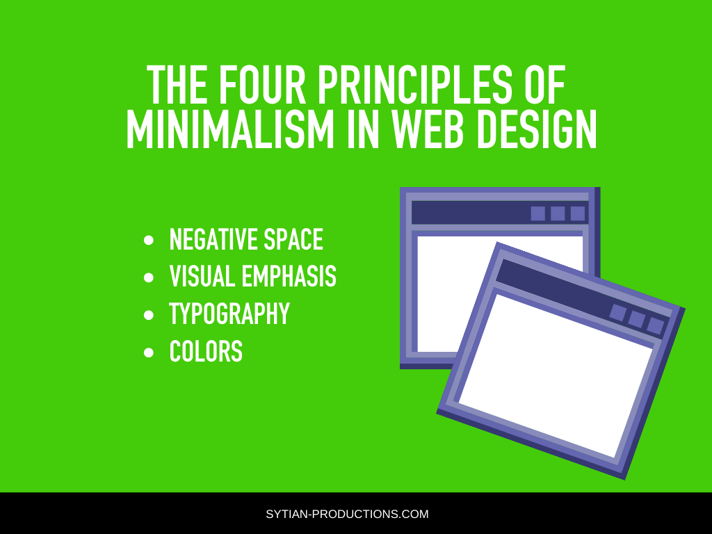
Minimalist web design follows four basic principles in order to combine simple aesthetics with functionality to provide the best possible user experience for your website.
Negative Space
Much of what you do to create a minimalist web design isn’t about what you add, but what you don’t add. The proper use of space creates emphasis, so the elements you do put in actually stand out. Having clutter surrounding the important elements only serve to make them less visible to viewers who browse your website.
The trick is to have enough space in between elements to distinguish them from each other while not having too much space that it looks empty. For example, you want enough space in between paragraphs of text in order to make them easier to read, but not too much that you pretty much break them up and make them look like they have no relevance with each other.
The same thing goes for visual elements. If you have an important element like an image or video that you want viewers to pay special attention to, you center it and space it out from everything else just enough to make it stand out without making it look like it has nothing to do with each other.
The proper use of negative space can actually make your message easier to understand. It helps you put everything in their place and make them stand out on their own while still adding to the rest of the web page. It creates balance, provides direction, improves readability and comprehension, and makes your website both aesthetically pleasing and functional.
Visual Emphasis
Sometimes, negative space alone isn’t enough to create visual emphasis. You must also use other means like size, weight, and contrast to emphasize important parts of a web page. Visuals that need to be emphasized include images, videos, and the typography you use for headline and subtitle text.
Google reports that the opinions of users on a website gets formed in just 17 milliseconds. In just a glance, they immediately know whether they like a website or not. Through these findings, it was determined that users are more attracted to simpler visuals as they don’t look cluttered and elements are easier to see.
The first impression that users get from the visuals dictate the usability of the website as they want to use a website more if they like how it looks. Minimalist websites should have high-quality visuals that are striking and original to pull audiences in.
Typography
Most minimalist websites tend to feature bold headline fonts paired with smaller body text that’s legible above all else. The reason for this combination is simply because it works. Text is meant to be read, so the font faces used in your website should prioritize that.
There should also be enough negative space between blocks of text to distinguish between titles, subtitles, and paragraphs. Meanwhile, paragraphs should be broken up with relevant images to make the message of the text better understood, and there should also be enough negative space between those images and the text to distinguish between them.
Typography has a design language on its own, from font faces, styles, and weights, as well as spacing and other attributes that let you convey both your message and the overall character of your website.
How text is used should be different for various parts of your website. The homepage won’t need that many words, making use of bold typography with minimal design elements to make an impact. Meanwhile, blog posts, the about page, and so on will have more body text.
Apart from grabbing attention, good use of typography can also make comprehension and navigation much easier. Choosing the right fonts make text more readable and create a clear informational hierarchy, leading to good user experience.
Colors
You may notice that minimalist web design makes use of colors that are both easy on the eyes and help create emphasis on important elements. They can range from neutrals and pastel colors in abundance to primary and neon colors that are used sparingly and intelligently.
Color is known to evoke emotion and help both design and copy to engage with users in a deeper and more instinctive way. As always in design, color theory is an important part of considering which colors will work best for both your website and your branding.
Whatever colors you decide to work with, they should create a pleasing and inviting user experience. Users subconsciously respond to your color scheme and learn how your brand connects with them through your website.
Conclusion
Minimalism is more than just a theory and a design principle, but it’s now more of a lifestyle. When less could be more and simplicity is the key, minimalism should always be on top of your web design game.