The Basics of Responsive Design
Whether it’s a desktop computer, a smartphone, or even a handheld gaming console, your website has to look right in that device every single time.
Nowadays, responsive design is a standard part of the web design checklist. You have to have it or it’s no good. It’s just a part of an ever-changing list of standard procedures and trends in web design, which is still evolving due to advancing technologies and new innovations in both hardware and software.
Only about a decade ago, people were only starting to get used to having wireless internet connections and touchscreens. Nowadays, we can’t imagine life without it. A big part of that transition is responsive design making websites a lot easier to view and engage with in mobile devices. If your website has no responsive design, it will make visitors go somewhere else.
What Is Responsive Design?
Responsive design is an approach to web design that accounts for the user’s behavior based on the device’s screen size, platform, and orientation. The web designer accounts for this by having web properties that let web pages adapt to whatever device it’s displayed in.
Usually, this is done using a “mobile first” principle, especially for websites that tend to attract more smartphone and tablet users. It then scales up in order to adapt to larger screens. This has now become the norm with web design as mobile platforms have become widespread throughout the world.
The need for responsive design is driven by the understanding that more and more people are accessing the internet through mobile devices, as opposed to traditional access through desktop computers and laptops. Mobile devices also offer various capabilities such as touchscreens, GPS location data, accelerometers, front- and back-facing cameras, and so on.
The basic practice in responsive design makes use of a mix of flexible grid layouts, images, and intelligent use of CSS media queries. When users switch between desktop/laptop to smartphones or tablets, the website must automatically switch to fit the screen resolution, as well as accommodate the images, videos, and other media. It must also account for whatever is supposed to work underneath the visuals, such as scripts.
You may also have to consider whatever software configurations are on the device. For example, if the user happens to be using a VPN on their phone, the website should not block access to the page. The website must be able to automatically respond to the user’s preferences so as to not have a need for different designs and development for every new device that’s released on the market.
Also, responsive design forces web designers to simplify their thinking. Since the screen sizes of mobile devices are limited compared to desktop platforms, there’s a lot less real estate to work with. Visual elements that are usually staples of a desktop website such as sidebars, social media embeds, ads, widgets, and so on may not fit in a mobile site.
Catering to the mobile experience is all about combining simplicity with function, adding only what is truly essential. That’s the core philosophy behind responsive design.
The Three Main Components of Responsive Design
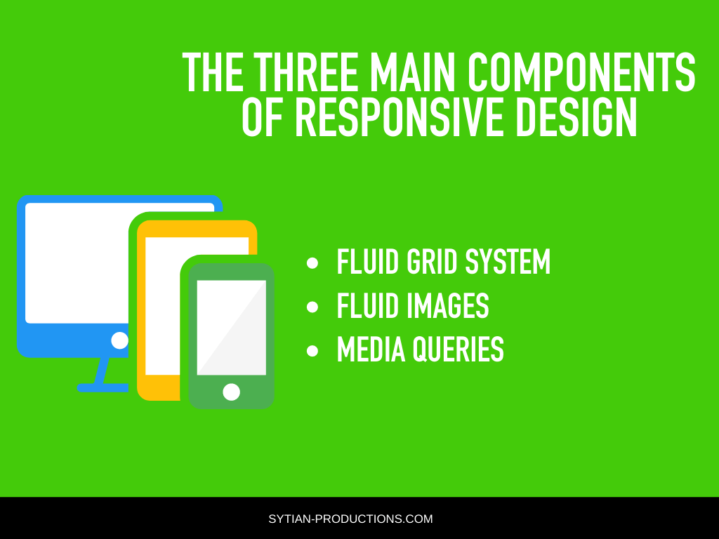
While loads of other stuff may come into play in some cases, there are three main components in responsive design. They are fluid grid systems, fluid image use, and media queries. You must learn how to use all these three components in order to be proficient with responsive design.
Fluid Grid System
The grid system in web design comes from the world of print, serving as a standard of laying out visual and text elements on a page in absolute measures. As the World Wide Web became more mainstream in the late 90s and early 2000s, the practice of laying web pages out on a grid carried over, and it’s still a major principle in basic web design today.
Back in the day, before the popularity of mobile devices with web browsing capabilities, web designers considered the screen resolution that most desktop users have and designed within that width as the absolute measure. But nowadays, with responsive web design, web pages have to look good in whatever resolution they’re shown in.
Modern web designers still use a grid to lay out their web page elements. However, this grid must be made flexible. This is how it’s basically done.
Target Size ÷ Context = Relative Size
Target size is the width of the wrapper for your web design.
Context is the screen size your users will likely use to view your website.
Relative size is the percentage of the width of the screen you want your web design to be shown in.
Let’s say you tend to design within 960 pixels and your users will likely use devices with a maximum width of 1280 pixels on average.
960 ÷ 1280 = 75%
That means you want your design to show up in 75% of the screen. By using that relative size, you can have your website shown in the middle 75% of any screen, regardless of what device or screen size is used to view it.
You can also use this principle on any child element within your wrapper. Instead of having a pixel-perfect layout, thinkin percentages of the screen.
Fluid Images
In responsive design, you want images to scale according to whatever size the container is at the moment. The easiest way to make images fluid is to set the maximum width to 100% of the container.
img { max-width: 100%;}
That CSS code tells the browser to set the size of the image up to its maximum width while still staying within the bounds of the container. This is to prevent an image from being stretched whenever the container is larger than the image. Otherwise, if the image is stretched past its size, it can result in degradation of image quality.
If the container is made smaller, the image will shrink along with it. This also maintains the aspect ratio of the image, so you won’t see the image being squashed or stretched out of proportion.
You can use an image that’s much larger than your container in SVG format, which makes for the smallest possible file size while still being compatible with most modern web browsers.
Media Queries
Media queries are the secret behind making your web design truly responsive. They’re designed to alter the layout of the web page according to the screen resolution the website is currently viewed in.
For instance, let’s say your web page shows two columns on desktop resolutions. You can use a media query to specify up to what resolution that is before it starts going down to the screen resolution of a smartphone.
@media screen and (min-width: 480px) { /* settings for larger phone screens */ }
@media screen and (min-width: 960px) { /* settings for desktop screens */ }
If the web page is displayed within the range of screen resolutions you specified in your media query, you can have it remove one of the columns so only the other column is shown, as well as modify or remove other elements that don’t look that good or aren’t essential on mobile.
This works great with a mobile-first approach, where you define your design on mobile devices first, then scale them up from there. You can define each “breakpoint,” having more and more elements appear as the screen gets larger.
Once you understand your user base, the devices they tend to view your website in, and how you can account for it through media queries, you should be able to define each breakpoint with enough accuracy.
Using a Framework for Responsive Design
Instead of having to do responsive design for a website from scratch, you can make use of an existing framework to adapt for your web design. This makes things a whole lot easier, although you can’t just slap it on your website and call it a day. You still need to do some work to make it fit your vision and needs for your website.
For instance, there’s Bootstrap, which is perhaps the most popular framework for front-end web design these days. Its solid mobile-first responsive design and being completely free to use is what has made it beloved by web designers the world over, and it has now become an industry standard.
Conclusion
Responsive design is a standard practice that you need to be proficient in to be able to keep up with modern web design. It takes a good bit of practice in order to get there, and mastering its three main components will take you most of the way there.
You can apply these principles to a framework and design your website around it, and you’ll soon become familiar with the ins and outs of responsive design. Soon enough, you’ll be designing whole websites that are functional and mobile-friendly in no time.