How Color Psychology can Impact Your Web Design
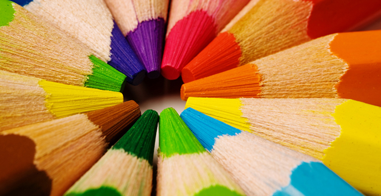
Color psychology reflects human emotions relative to colors. It’s the study of how humans perceive things or how they react in relation to the colors of things. While we all have our favorites, understanding color psychology will significantly impact day to day human decisions in terms of your company, products, services, and especially your company website. As a business owner, you must have a deep understanding of how each color will affect your target market. Although, different cultures have their own color meaning, universal color psychology still applies to most people.
Different colors mean different things. They play a major role in people’s judgement and perception. Did you know that 90% of people’s assessment in a product is solely based on colors? In buying decision, a color is an essential element that will affect a person’s decision whether he may or may not buy a particular item. Colors affect the mood and attitude of people consciously or subconsciously. Its shade, its hue, and its tone, the overall effect of a particular color can mean the difference between an effective and ineffective web design.
Sometimes, though, people may be persuaded depending on their favorite color. But the use of the powerful combination of color schemes can always sway people to the positive side. Subconsciously we all respond the same way to the same color, whether it’s our favorite or not.
Color is just one aspect of a web design, while there are many other design elements that affect your website performance, focusing on color scheme is just as important.
Colors can be broken down into two categories: primary and secondary.
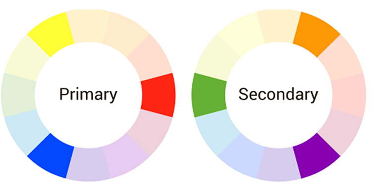
Primary colors are mixed together to form another color. These colors include Red, Blue, and Yellow.
Secondary colors are products of mixing two primary colors together. These colors are Green, Orange, and Purple
Neutral colors such as Black and White also play an important role in people’s perceptions.
Colors and their meaning.
Blue is soothing by nature. Most admired by a male persona, it has a balancing effect on the eyes and pleasing to look at. It is often associated with depth and stability. Usually, it’s a representation of attributes such as trust, loyalty, truth, and faith and it is strongly regarded as a tranquil and a calm color. Though a masculine hue, blue has a peaceful effect on people. It is the color of intellect. It affects people mentally rather physically. A color blue will stimulate the mind and will produce a calming effect on people.
Often, it can be used to promote products and services relating to water, air, and sky such as drinking water, airlines, air conditioners, or cleaning liquids and agents. Blue is also attributed with qualities such as authority, cleanliness, strength, peace, infinity, and serenity. Because it is linked to intellect, it can be used to promote high-tech gadgets as well.
Although, blue can also be associated with depression. While it’s calm by nature, often, people regard the expression, feeling blue as sadness.
In addition, it’s been said to avoid using blue when promoting food products because it can suppress your appetite.
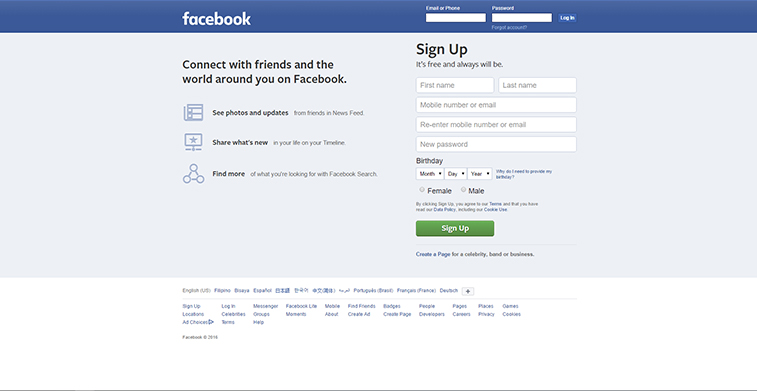
Many regard blue as the most appealing color of all colors. Notice how most of social media sites use the color blue as the major color on their web design? Facebook, Skype, Twitter, and WordPress, all these sites, use blue as the dominant color of their brand.
- Facebook uses blue because according to Zuckerberg, it’s the richest color for him.
- Skype uses blue because it speaks of innovation.
- WordPress also uses blue because it conveys stability and trustworthiness.
- Twitter uses blue to represent a beautiful day accentuating the color of the sky.

Red is a strong color. It is often associated with fire, war, danger, and power. Probably the exact opposite of blue, red usually applies to attributes of love, desire, and passion. It’s an intense color, powerful and very emotional to the extreme, its effect on people is very strong. It has a sense of urgency by itself, with the color red it catches people’s attention and can even raise blood pressure. Notice how all the stop signs are red and how a danger sign is usually painted with a red color? It’s a powerful color that can also represent an attribute of courage. Notice how most of country flags have red in them? It’s a sign of bravery, strength, and valor.
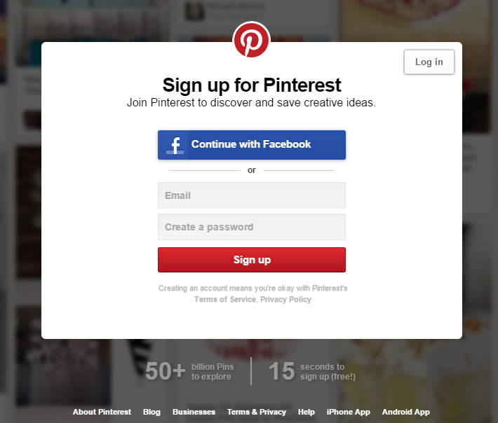
Because the color red attracts attention, it makes people act very quickly. Subconsciously it makes people decide quickly. The color itself represents urgency. Company websites can utilize the color red on their calls to action; it’s perfect for “Subscribe Now” or “Buy Now” buttons. One good example of red call to action button is from Netflix. Notice how the buttons match their logo color? Netflix uses red on their logo and cleverly matched it to their primary and secondary calls to action. Another example is Pinterest. On their sign up page, while you can sign up using Facebook, Pinterest cleverly applied the red color on their Sign up button to attract new members by creating a somewhat sense of urgency with the powerful color of red. Because blue is of soothing nature and can overpower red, Pinterest red Sign up button works cleverly.
Red also relates to power which is why most sport cars use the color red to represent sleek, high-powered, fast engines. Note how Ferrari is mostly associated with a red color?
Remember, red represents urgency, danger, power, desire, love, passion, and strength. Use red for your call to action buttons to create a sense of urgency so your target market can quickly make firm decisions.
It is also often associated with food. Famous food products that utilize the color red includes Kitkat, Coca-Cola, and Pizza Hut.
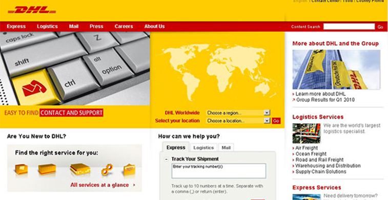
Yellow is regarded as the lightest color in the color wheel. Often attributed to joy and energy, yellow exudes confidence, warmth sense of friendliness, optimism, and creativity. It’s bright and illuminating creating an effect of happiness, positivity, and fun. While it often denotes creativity, yellow is a methodical color; it relates to logic and critical thinking. During exams, yellow can also help with focus, study and information retention. Because of its logical nature, yellow relates more to mind than to the heart.
Because of its bright feature, yellow can often stand out on its own. Notice famous logos such as Shell and DHL use the color yellow as the main color of the design?
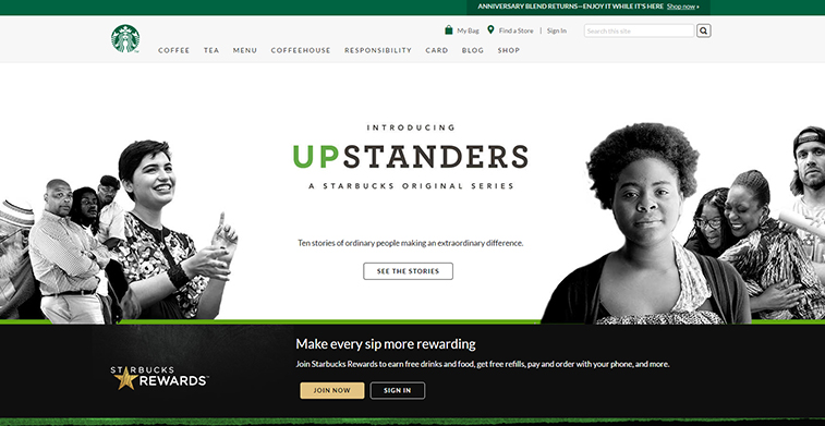
Green is a combination of the color blue and yellow. It often symbolizes nature, growth, harmony, and fertility. Usually, it also symbolizes money. While blue denotes calmness, the color green often suggests a restful color that is pleasing to the eyes. Often it suggests stability and endurance. Unlike red, green means safety. Usually favored by well-balanced people, green often denotes order. It is also often used to symbolize the environment. Note the signs eco-friendly are often color green? With deep regard for nature, green usually represents companies who are in agriculture, recycling, landscaping, and gardening.
Because of its harmonious representation, green often becomes easy to look at and offers people a relaxing state of mind. Did you know that Starbucks logo used to be brown? Coffee shops often employ the brown color on their corporate identity. But Starbucks veered from the norm and decided to go from brown to green. While it’s not a rebranding strategy, Starbucks wanted to tell the world that they are expanding their product line and because green often denotes freshness and cleanliness, it seemed only appropriate to use it.
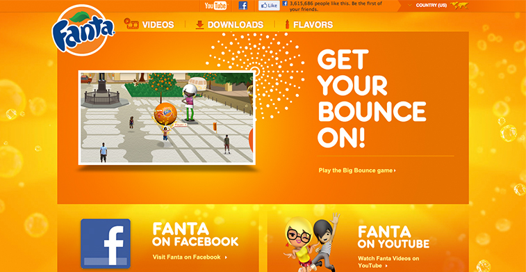
Orange is the combination of the color red and yellow. A combination of a fiery red balanced perfectly well with a happy yellow, orange comes somewhat a cheerful color with desire and passion. Often denotes to gut instincts, orange is a balanced rage with hints of reservation. It’s a positive color that uplifts spirits and often is related to rejuvenation. Not as aggressive as the color red, orange can also stimulate the mind to act. It increases oxygen supply to the brain that creates an invigorating effect. Often it relates to spontaneity, adventure, and the thrill of excitements, it can spark up conversation between people. Because it’s a playful color, most toy companies employ the color orange to attract kids. Notice how Nickelodeon, a cable channel that airs cartoon shows, employs a color orange on their logo? Its vibrant and playful attributes often attracts kids. It can also be attributed to food. One good example is Fanta. Note how they employ the color orange in their logo.
Orange is vibrant, loud, and playful it can also mean that you are a risk taker and often it is attributed with affordable prices. Orange is perfect for your business if you want to stand out and be regarded as different from the rest.
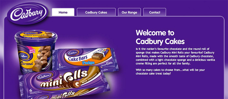
Purple is a combination of the color blue and red. Often it applies to royalty, wealth, luxury, magic, extravagance, wisdom, nobility and ambition. In products, it often relates to high quality.
Usually associated with spirituality, the color purple often brings nostalgia to people. Often it is associated with feminism, but today, more men are accepting the color purple.
Chocolate is one food that is usually represented using the color purple. One good example is Cadbury. Using the purple color, the company is able to highlight the quality of their chocolates denoting its royalness in taste and in texture. Did you know Nestle and Cadburry were in a legal battle over the right to use the color purple on their product?
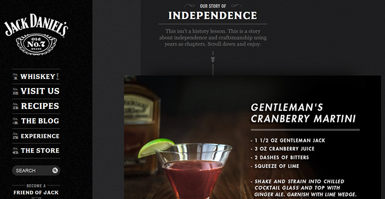
Black arguably is often regarded as the absence of color. Often it symbolizes sophistication, class, and elegance.
Because of its class, black is a great color to employ especially if you want to stand out in the market. Two great examples are Mac Pro and Jack Daniels website. Note how their websites have an alluring effect on the eyes that somewhat create a mysterious effect drawing visitors to inquire more. Their effect is so powerful, when you look at the sites, a feeling of sophistication and class start to pile up. Their sites speak of elegance and beauty with a subtle touch of class.
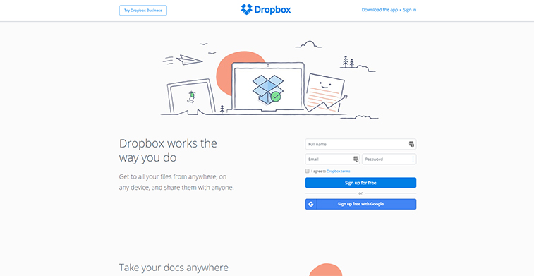
White is often associated with light, purity, perfection, purity, and simplicity. Often white is used on a web design to balance other colors out. Known as whitespace or negative space, white is often used to make web content readable.
One of the most popular and effective minimalist web designs that utilize whitespace is Dropbox. Note how simple their site is and how the use of interactive drawings are accentuated because of the white background. Because white is often regarded as simple, using whitespace on your company website can greatly highlight other design elements of your company site.
Understanding color psychology can impact your target market. Using this to your advantage, through colors you can subtly speak to your customers’ subconscious mind.
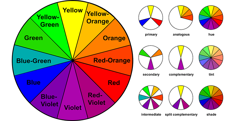
Having a basic knowledge of what each color represents, choosing the right color scheme is the next step in creating an effective website. Color scheme is the arrangement of colors. There are at least four common types of color schemes, namely Monochromatic, Complementary, Analogous, and Triad.
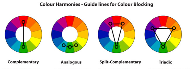
-
Monochromatic
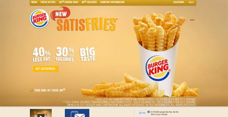
Refers to color combinations of the same family- tints, shades, and tones of a single color. For example the color yellow can range from butter, corn and honey to gold, medallion, and canary. While all these are shades of yellow, using different hues of a particular color can bring contrast to the overall effect of the design.
-
Complementary
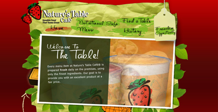
Refers to a combination of colors which are opposites to each other on the color wheel. Often the effect is vibrant. Popular complementary color combination, includes red and green combination, yellow and purple combination, and orange and blue.
-
Analogous
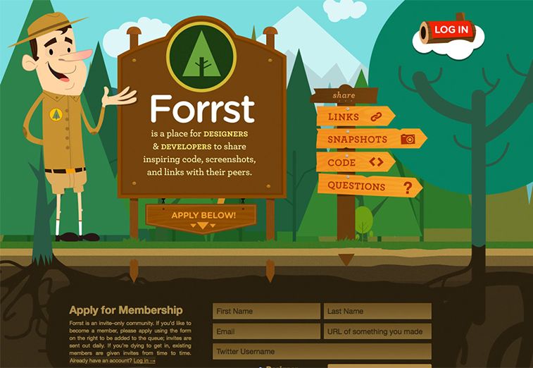
Refers to color combination of colors that are closely placed next to each to each other in the color scheme. The overall effect of the design layout becomes comfortable and harmonious
-
Triadic
Refers to color combinations that are evenly spaced out in the color schemes. The effect is vibrant, particularly with one of the colors. The two other colors are used for accent only, and the main purpose is to let one color dominate the entire color scheme.
Categorizing your target market using color psychology: Note How Men and Women are different
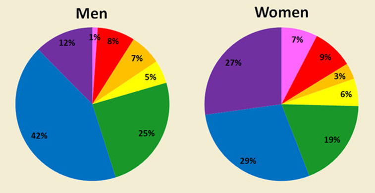
Men, are attracted to dark colors such as Blue and Orange. They prefer shades over tints. Shades are formed when black is added to a particular color. Often as a result, the color becomes intense and darker.
While women are more attracted to soft colors such as Red and Yellow. They prefer tints over shades. Tints are colors to which white is only added; it is often called as pastel colors- soft, light, and milky.
Both men and women work out. But do you notice how a fitness site directed to women is different from that of men?

For example, Bodybuilding.com generally speaks to men and address their weight problems. Note there navigation menu on the top part, how they apply a black hue paired with the color blue. While both men and women prefer blue, the combination of black and blue speaks more directly to men.
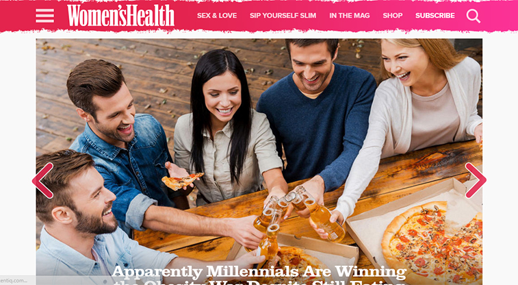
Another example that can differentiate how women and men react to different color is a fitness site directed to women, Women’s Health website. Note how the upper part of the site uses a pink hue and the navigation arrows are also in pink. Paired with whitespace, the pink is highly accentuated to give an effect that the site speaks directly to women.
Note how the same topic, fitness, can have the different design to capture different target market.
Another example is a magazine website.
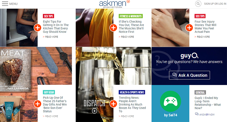
For men, one popular site is Askmen.com. Note the use of different shades for each button on corresponding to each article. Blue, gray, red, and green- note that these colors are darker. Men respond well to darker hues as opposed to lighter ones.
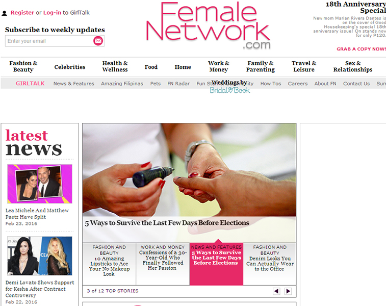
Another example, this time, geared towards women is Female Network. Note the use of whitespace paired with light pink, light blue buttons, and red. As mentioned above, women prefer lighter hues to darker ones
Knowing this bit of information can impact your web design. If used correctly, the colors of your design can mean the difference between closing a sale and a no sale at all.
Color is just one aspect of web design, but understanding its meaning and psychology can greatly impact your conversion rates, sales inquiries, and popularity across the web. While most people prefer different colors over the other, it’s important to follow what the majority favors. As business owners, we can all agree how passionate you can become in relation to your products and services. Because of this passion, often times, you forget what your target market wants and most of the time in terms of design, you utilize colors that you prefer.
Remember, blue is of soothing nature, red creates urgency, green often relates to environment, yellow relates to caution, orange symbolizes vibrancy, purple denotes luxury, white often regarded as simple, and black denotes class and elegance.
What other significant factors of color psychology, can you think of that will greatly improve a particular website. Share your comments and suggestion below!