Common Typography Mistakes in Web Design

At first, typography looks fairly straightforward. Choose a font, choose a size, maybe make it bold or italic if you want, and sometimes use a different color, right? As always, the truth is more complicated than that.
You can say that much of what goes on with typography is invisible in that most people aren’t supposed to notice what you did with it. The result is simply them being able to have a seamless user experience as a result of your careful and non-arbitrary choices.
This is especially true in web design. Much of a website is about conveying information, and text is a major way of doing that. If a website’s typography is in any way bad, whether it’s a bad combination of font faces, doesn’t match the rest of the web design, or isn’t legible at all, then the website will fail its purpose.
Let’s take a look at how web designers tend to fail in typography and learn from their mistakes.
Why Typography is Important for Web Design
First of all, before we look at common typography mistakes in web design, let’s review why typography is important for web design. While the web designer may not have to directly deal with the content, it’s their job to make sure that the content will come through with utmost clarity, and a big part of that is in the typography.
Typography is all about facilitating the viewer’s focus, letting the text convey its message in the most effective way possible while also being aesthetically pleasing at the same time. Most people aren’t supposed to notice good typography, unless they’re also designers. However, everyone will notice bad typography.
Most people would think that websites should be about their content and not just their looks. However, typography can directly affect how the content is presented. Therefore, it can make or break your website. If your audience can’t comprehend your content or find it off-putting because of a poor choice of typography, then they will likely go somewhere else for that information and even be convinced that your brand is not for them.
Your website’s typography can represent your brand. If you don’t care enough to make your text both legible and visually inoffensive, then people will think your brand isn’t conscientious enough to care about their needs. That makes typography something you shouldn’t take lightly in your web design.
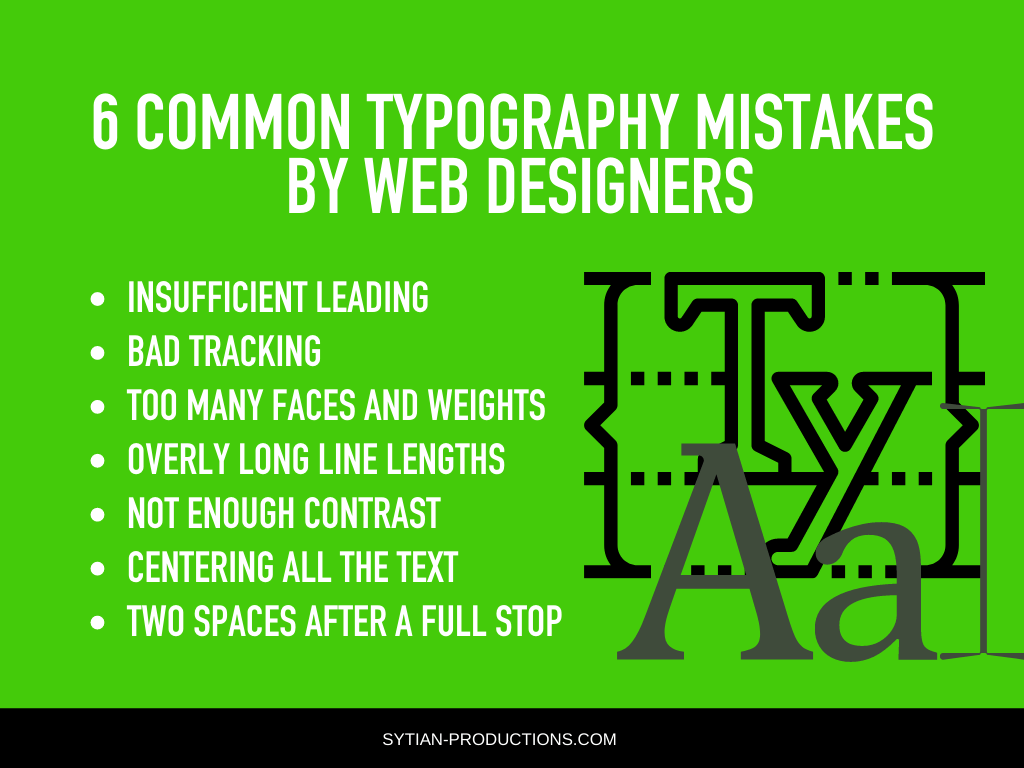
6 Common Typography Mistakes by Web Designers

Insufficient Leading
Leading is the space between two lines. It was named after the strips of lead used in metal type for printing presses, which made sure that there was an adequate gap between lines. Nowadays, you may know it from word processors as line spacing.
Not having enough line spacing makes paragraphs bunched up and hard to read. On the other hand, having too much line spacing makes separate lines too disconnected and even look like they’re different paragraphs entirely.
There’s no one value for the best line height as it depends on the type of content you have on your website and how you present it. You can choose between single and 1.5 line spacing and go with which one looks best for your copy.
Bad Tracking
Tracking is the amount of space between characters. The greater the tracking (positive), the more space there is in between characters. If there’s too little tracking (negative), words look bunched up and virtually unreadable.
However, having too much space in between characters can also make text hard to read. Tracking is usually adjusted by designers to fit a particular line length for various purposes, such as title text or certain forms of copy.
In most cases, leaving the tracking at the default value provides the best legibility for most fonts. After all, those fonts were designed with that amount of tracking in the first place to make text readable with it.
If you must adjust the tracking for a particular line of text, you must take care to make sure that words don’t look like a line of letters that have nothing to do with each other.
Some designers even decide to reduce tracking at times to as much as -20 to make text appear heavier, which helps with headlines and other prominent text.
Too Many Faces and Weights
Using too many fonts can make your text look cluttered and confusing. This is one of the biggest mistakes that web designers can make, especially beginners who don’t yet have experience in font selection.
As a rule of thumb, it’s best to limit the number of fonts used on your web design to a maximum of three. The fonts you do use have to complement each other. Most would just go for two fonts, one for headlines and another for body text, an approach that’s advisable.
On some occasions, you may need more than three fonts, but that would be for very specific reasons. More than two or three is not recommended as it can disorientate the readers.
If you need some text to look different, you can look into changing the style and/or weight instead to make it look different and stand out.
Overly Long Line Lengths
It was determined during the heydays of print that it’s best to limit headlines to a maximum of 75 characters. This is done to ensure legibility as excessively long lines tend to be harder to read. Newspapers and magazines understood this, especially since their revenue is dependent on eye-catching headlines that make readers want to know more.
The same has been true for online publications. Whether it’s a blog post or a video, having a title that grabs people’s attention right away is still an effective tactic, and having titles and headlines that can be read at a glance is crucial.
But it’s not limited to headlines. Your body text should also not have excessive line lengths. The more the eyes have to go from left to right, the harder the text is to read. Ideally, your line length should not exceed what’s reasonably legible on a phone screen.
Not Enough Contrast
Having insufficient contrast can make your text hard to read. If you have a light background, you should use dark text; if you have a dark background, you should have light text. A major consideration for your color selection with your web design is how it presents your content.
To check if text is hard to read against your choice of background, step away from your screen or scrunch up your eyes and see if you can still make out the characters of your type. If you can’t read the words clearly enough, you’ll have to adjust your colors.
Centering All the Text
You should only center important text. Doing so is mostly for creating emphasis, so it becomes pointless when all your text is centered. That only makes it much harder to read, especially with varying line lengths.
There are some designers who swear off centering text, seeing it as tacky and unnecessary. This is due to novice designers having a tendency of centering text way too much due to wanting to make everything symmetrical.
There’s always a place for centered text, but only if it’s used sparingly whenever it’s absolutely called for. You should embrace asymmetry for web design as it’s not a picture, but a presentation of useful information.
Two Spaces After a Full Stop
This can be a surprisingly controversial topic. The double space after punctuation was an old practice during the heydays of the typewriter and early print, helping to better separate successive sentences and avoid potential under-spacing.
However, it’s no longer necessary in the digital age. But every now and then, you’ll meet someone who puts two spaces after a full stop due to having been taught that somewhere down the line. With modern word processors, desktop publishing tools, and web browsers, there’s no more need to worry about under-spacing as text is now more accurately rendered.
If you have a copywriter who tends to add double spaces, you may need to inform them that it’s no longer necessary.
Conclusion
As with everything else in web design, your typography should lend to how your website conveys its message and tells its story.
For example, if you have a website that talks about historical or worldly things, you may want to use serif fonts that convey that seriousness. If you have a website about technology or trendy things, you’ll want to use sans serif fonts that’s bold and eye-catching.
Typography lends a lot of personality to your website, so you can’t underestimate how much it does to engage your audience. If you want to have the best possible website for your brand, then you want to make sure your typography is on point.