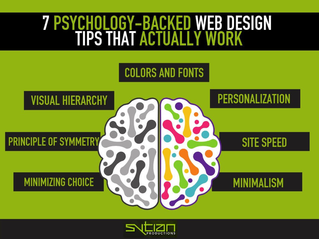
7 Psychology-Backed Web Design Tips that Actually Work
Good web design is more than just about delivering content and making a website look good. It must also make people see what you want them to see and feel want you want them to feel. The psychology behind web design is about both subtlety and science.
Web designers all over the world have built up a body of knowledge on the psychology of web design over the years through both research and trial and error. The design principles that work are now well-known, and you too can incorporate them into your web design.
Do take note that these are just guidelines that you can use, not hard and fast rules. Just know that these seven web design tips have been proven to work and are now common practice.
Visual Hierarchy
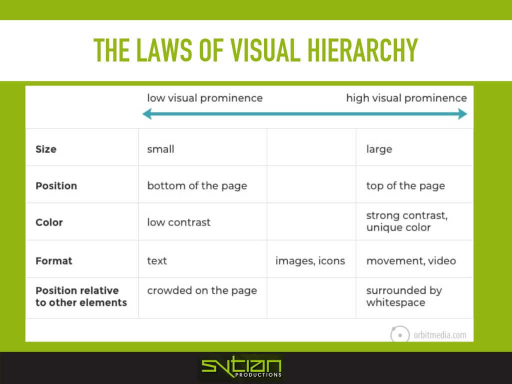
As the audience go from the top of a page to the bottom as they go through your content, their eyes will first go to what stands out, and then look at everything else if it interests them.
The top fold of the page, namely everything they see first before deciding to scroll down, should be where the most important elements should be. Those should be what you highlight the most, but not highlight so much that it overwhelms whatever follows it.
You can increase the visual prominence of an element by making it bigger, having it in a color that stands out, and/or having movement or adding more white space around it.
This is simple enough with text, especially the headline, which you can enlarge and use a bolder font for. You can also add an image or video to add more visual prominence, calling attention to it as soon as your audience lays their eyes on it.
Elements of lower visual prominence tend to be smaller, sit near the bottom of the page, have lower contrast, and have less white space around it. They need not look like a lump of tiny text that looks more like fine print on a legal contract, of course, but make sure they blend into itself.
So, the visual hierarchy tends to go as follows—bigger and more important elements on top with images or video, then body text and other images and icons going down, and then miscellaneous elements on the bottom.
Colors and Fonts
Two major elements of any web design include the colors and the fonts used for the text. Colors and fonts can evoke emotion in various ways.
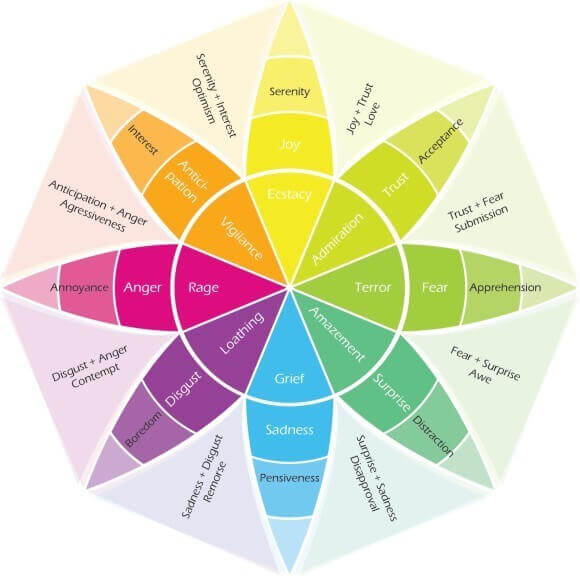
Robert Plutchik, an American psychologist and researcher, is well known for his “Wheel of Emotions”—a color wheel that illustrates what different colors can make people feel.
Colors in the wheel that are opposite each other are said to evoke opposing emotions, and different shades of that color are also a gradient of emotions.
Using this as a guide, you can make both your branding and web design bring about emotions that you want your audience to feel when they see your brand.
Do take into account cultural and personal factors when it comes to color preference and know that this wheel is merely a guide and not to be taken as absolute.
The same can be said of fonts. Different styles of fonts can exude different feelings and present ideas in different ways. For instance, most people would not likely be able to take a hard-hitting news or scientific study seriously if it were written in Comic Sans.
Picking the right font for your web design isn’t just about choosing what looks good, but also project the right image about your brand to your audience.
Gestalt Principle of Symmetry
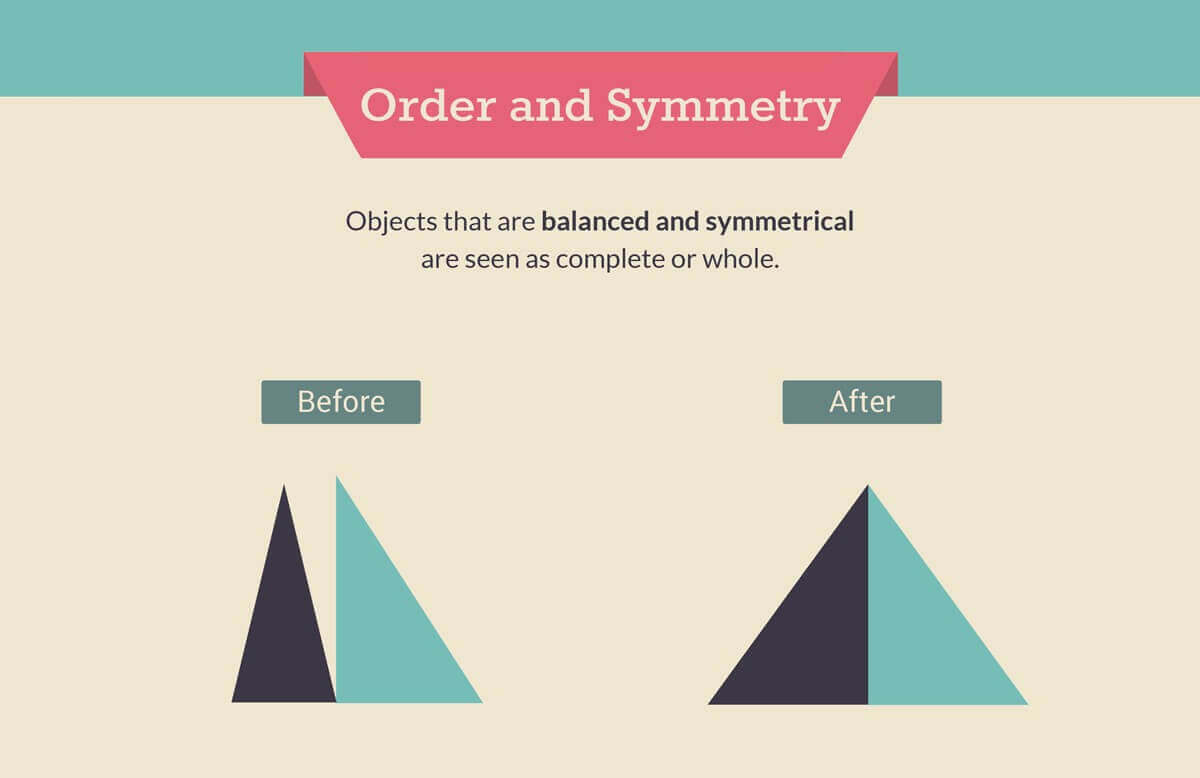
Disorder sows discord in people. Making things organized in web design is about creating balance and symmetry, not just in layout, but also in how you present things.
The Gestalt principle of symmetry covers many things, from how like elements should be positioned close to each other to how they should be shown in the same color and be parallel in a column or row.
Hick’s Law of Minimizing Choice
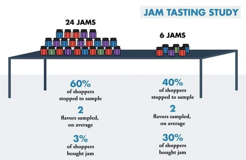
Psychologists William Edmund Hick and Ray Hyman conducted what’s popularly known as “the jam study,” wherein they assessed the human capacity for cognitive information. What they found out was that when the number of choices is increased, the amount of time to make a decision also increases since there’s only so much you can hold in your head at one time.
The more options are presented to people, the more time it takes for them to choose which one to go for. They can second guess themselves since they don’t want to regret their choice, and they can give up midway because choosing may be too hard.
It’s like how people get hung up when they’re at a fast food counter and they just stare at the menu for what seems like forever. You may be mentally yelling at them to just order something, but they’re inundated by choice right then and there.
This holds true in just about anything you put into your web design, from the number of fields are in your form, number of social share buttons in your blog content, number of CTAs to show, number of items in your navigation menu, and so on.
One is best, two is a coin flip, three is a multiple choice questionnaire, four or more is akin to a mental juggling act.
But if you really must have options there, show them one at a time if you can. If you have to have them in a row, have some white space between each option. Let people be able to discern each choice and be easily interactable. If you really have to, at least make their lives easier.
Personalization and Social Proof
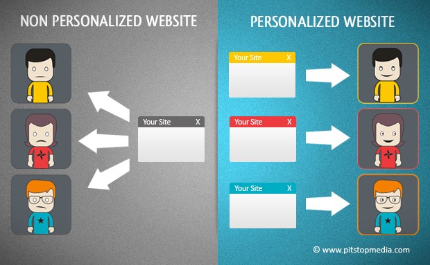
People appreciate having their preferences catered to. The real goal of web design is not just to present information optimally, but also to connect to the audience on an emotional level.
It’s one thing to convey information, but to present it in a way that can best engage your particular audience is paramount. There are various ways to make your website more personalized to your audience. It’s all about storytelling, and you want to tell stories that your audience can relate to.
There’s steering your content to better suit your target audience’s taste, according to the information you may gather on your analytics. You can also make your website more customizable for users, letting them choose whatever theme they want the website to be viewed in. This makes your website more of a hub to them.
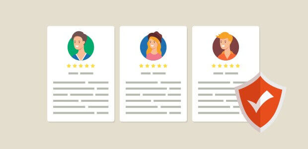
You can also have social proof in your website, thus convincing your audience more to tune in and avail of whatever you have to offer. This is not exclusively a web design decision, but it can be a boon nonetheless.
Have a review and/or testimonials section on your website, wherein users can most their feedback on your website. If your website is good and gathers mostly positive reviews, more users will be convinced to use your website for their needs as well.
Site Speed
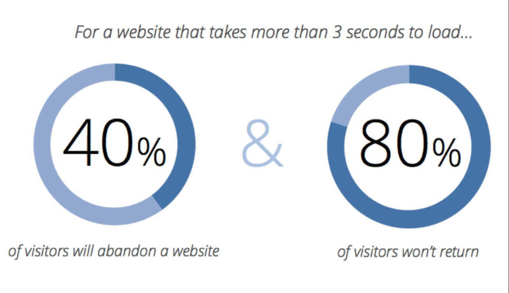
The longer people wait, the more impatient they get. They then second guess themselves and their attention starts to waver. This can happen in a matter of seconds, so your website loading time needs to be as snappy as possible to prevent this from happening.
There are plenty of things you can do to be sure that you’re getting as much speed as possible. For instance, you can use as few images as possible and make sure that images are properly compressed to minimize loading times. Same goes for scripts and other code that may add functionality to your website. If it’s not entirely necessary, it has to go.
There’s also the hosting for your website. Make sure it’s a reputable service with fast servers and as near to your target audience as possible. If your current hosting is not cutting it, then transfer to a different service that may give you more speed.
Every millisecond counts when it comes to site speed, so do what you can to shave off that time. A website that loads fast is a website that can do its best.
Simplicity and Minimalism
Less is indeed more in web design, but people tend to misunderstand simplicity and minimalism in websites as empty and drab. It’s not about having almost nothing in it, but merely not having visual complexity.
The more stuff there is in the website; the less it’s seen as aesthetically pleasing by the audience. Therefore, being able to strip away the non-essentials is key to promoting simplicity and minimalism in web design.
For instance, you can look at your sidebar and ask yourself what stuff you should keep. You may even think that the sidebar may not be necessary at all. If you do ditch it, you may find the resulting single column design to be a lot simpler with less clutter to deal with.
To keep things as simple as possible, it’s best to stick with a standard layout for your web design. While it may seem good to have something that’s not standard, most people may find it weird. If you’re looking to have your web design stand out, you can do so in other ways.
All of this is tied in by the use of white space. Using white space properly lets the audience distinguish between different elements of the website. It’s a zen thing in a way to have emptiness be what makes everything else stand out, which is indeed true for web design.