7 Common Web Design Pitfalls to Avoid and How to Correct Them

Web design has come a long way not just over the decades, but even in just the last five years. You have to stay on top of your game with new trends, technologies, and audience sensibilities affecting web design to make sure your website is doing all the right things it has to.
But mistakes can be made every now and then. In web design, these mistakes happen when something is overlooked or what was once a good thing no longer is. Either way, you would want to correct them and get your website back on the right foot.
Here are some of the most common mistakes in web design and how to correct them.
Not Using Mobile-Friendly Responsive Design
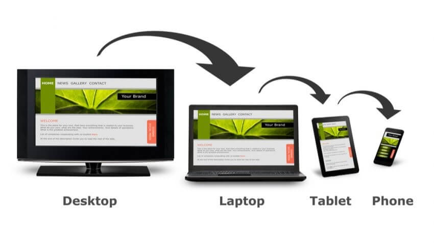
It’s likely that over forty percent of visitors that find your website most likely come from mobile platforms. Having a website that can’t be optimally viewed through a phone or tablet is a grave mistake that must be corrected as soon as possible.
Relying on desktop-only design makes your website hard to read and use, That turns many of that forty-plus percent leave your website right away, most likely never to return.
Fixing this may a require a website redesign or an overhaul of your whole web design or just adding either a mobile theme or media queries in your website’s CSS to resize and reconfigure your web design to conform with smaller devices that view it.
Hard-to-Find Contact Information
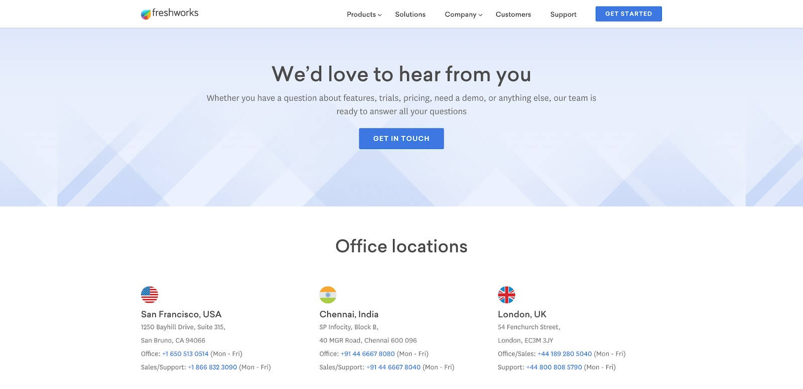
If your business’ contact details can’t be found right there on your homepage or in a matter of a few clicks, then your business website has failed for the most part.
A lot of your visitors may have gone to your website to know how to get in touch with you. They won’t appreciate having to move mountains just to find your email address or phone number.
The solution to this is easy enough. Most business websites put contact details either on the header or the footer. Put on there only what’s necessary, whether it’s your physical address, phone number, and email address.
Also add brief instructions on what to do while contacting you, if needed. Just make sure to keep that section as brief as possible and make it visible enough to find.
If that information is more extensive, then you’ll need to have a contact page instead. Have a Contact Us option on your main navigation menu that’s plain to see and format the page to make it easy for people to distinguish between different contact details and instructions.
You may even want to add a contact form in that page to make it even easier to reach you. If you’re willing to do so, add a chat widget on your website to help people get in touch with you right there without having to take an extra step.
No Search Box

A website without a search box is like a house without a door or windows. Visitors can’t find anything at their own accord, which can have them leaving soon after.
Even a hard-to-find search box can be just as bad. It needs to be right where people can find it right away, so it usually sits right next to the navigation menu or at the top of the body.
Adding one should be easy enough, as most CMS have some feature that adds it. Of course, the best way to curtail this issue is to have the search box as a priority in the first place. No website, especially one with a blog or product pages, can go without one.
Bad Font Choices

What fonts you use for the text in your website can make or break the design. That design choice can mean the difference between appropriate and balanced or tacky and outdated.
Using garish and unorthodox fonts like Blackadder or Comic Sans isn’t always wrong, but can be very risky nonetheless. If it doesn’t fit the web design, then it’ll just ruin it.
Whenever you’re not sure about what to use, then stick to the simpler fonts.. Actually, the simpler fonts tend to work best as they’re cleaner and more readable, which is a big part of good web design.
If you do need to use a font that’s different, like for headlines or such, make sure it suits your brand. Using the same font as your logo is a start, or at least something close to it. If it’s not easily viewable on its own without alteration, then find the closest one to it that’s readable.
Complicated Forms
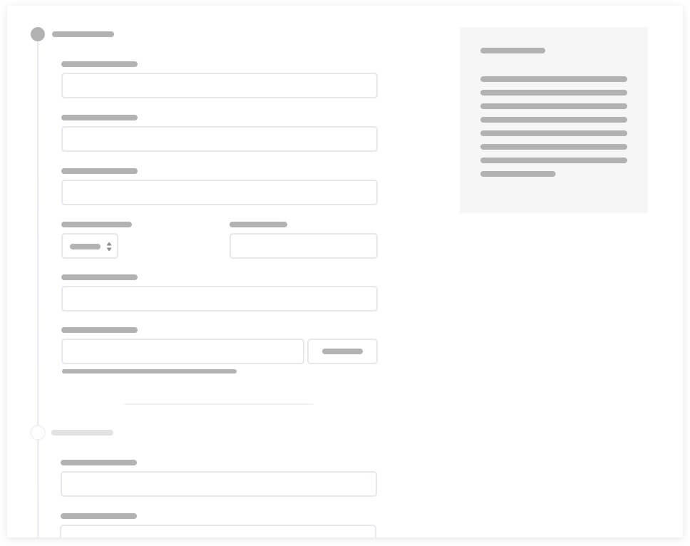
Having people fill out forms is asking much from them already, and filling out complicated forms can be tedious and tiring. If it takes too long to fill out a form, most people will just go “forget it” and abandon the form, even if it’s for something they’re interested in.
Making the forms on your website as simple as possible is key. The more information you need for processes like support, account registration, or customer surveys, the more complicated a form can get. It’s important to ask only for information you really need.
Look at the analytics for your forms pages and see which ones have high bounce rates. You then do what you can to simplify those forms. Reassess what information is really needed from those forms and prioritize the bare essentials and take the rest out.
No Social Media Integration

These days, there’s no excuse for not having social media incorporated into your website. Whether it’s just simple social media links on top or bottom of your website, or share buttons in your blog content, they’re crucial to making your website more relevant to your audience.
You can use plugins to quickly and easily add share buttons to your content. You can also add icons to your header and footer so people can know where to find you on social media. Having both is even better as people won’t have to make extra effort to share your content and follow your social media profiles.
If your website requires account registration, then consider giving people an option to register with their social media log-in. There are plugins that help with that, letting people join your website easily with just one click instead of having to fill out a registration form.
Lacking Clear Call-to-Action

Even if you have to most helpful website there is, having no call-to-action means you don’t get to capitalize on people’s attention. Once they get value from your website, like useful information or good deals, you’ll want them to convert.
If you do have a call-to-action on your page, but not a lot of people click on it, then that means it’s not clear enough. It doesn’t need to be in neon colors and be huge, but you should at least have it be visible enough for people to notice it.
That’s why having your call-to-action as a button is best. Have it in a color that makes it stand out from the rest of your content and its label be readable. Position it where people’s eyes can get to it as soon as they’re able to decide on converting.
That positioning can vary in different types of websites. Ecommerce websites can have it right around the top fold of the page, while a blog may have to have it along the bottom of the content. Wherever it is, make sure it’s optimal for the kind of website you have.