6 Design Styles For Your Business Website
In the world of web design, understanding new trends may significantly improve your company website. Keeping abreast with the latest web design styles and techniques can increase your conversion rates, sales inquiries, and online presence.
It is important to note that in this age, providing an excellent user experience is one of the goals of any website or an application. As web design styles and techniques continue to improve, designers and developers can better enhance user experience by utilizing these new trends. Although, professionals must take into consideration the pros and cons of each new trend. Because technological advances rapidly change the way users interact with the environment, designers must employ the basic element of an effective website.
Increase your website performance by utilizing any of these six web design styles for your company website:
-
ILLUSTRATIVE WEB DESIGN
An illustrative design is a graphic design element that represents a concept in the form of a drawing, a sketch or a painting. Often it tells or “illustrates” a story using creative hand drawn imageries.
To better understand, dating back to cavemen and primitive era, tribesmen drew or painted on the walls of their caves illustrating a particular concept or a particular story to explain their thoughts and points of view to their people.
Similar in parallax effect, an illustrative design utilizes a thematic approach. Most websites that employ this style often relies on a specific theme and use design elements such as character sketch or a mascot— hand drawn character i.e. an octopus. Using creative sketches, the design can impact audience significantly as people respond better to visual design.
Because of technological advances, illustrative design evolved from wall caves to the online arena. Introduced to illustrate stories on comic books, graphic novels, newspapers, and magazines, now, illustrations can often be seen in company websites.
This type of web design style is used to display the skill and talent of a designer. The goal is to convey a message using rich hand drawn imageries. However, illustration decay becomes imminent as efficient designs call for high quality photos instead of creative hand drawn sketches. While this can become a disadvantage, illustrations can still beat photography using detailed-oriented graphics, clean looking sketches, accurate drawing presentation, and meaningful finished character.
Pros
- Because people are visual, more than likely illustrations crafted beautifully will tend to stick in their minds much longer.
- Illustration designs can create your brand identity. Through this technique, your company image can be captured as this design is customized specifically to your company image.
- It can create a personal touch of your company that can give out a warm sense of compassion directed to your target market as it shows your desire and passion in your work.
- It’s much more vibrant, engaging, and interactive in terms of telling a story as opposed to content-based website.
Illustration websites are often recommended for creative agencies, marketing and advertising, as this technique will showcase how competent and creative a company is. Crafting an interactive design through illustration will show that if companies can do it for themselves, why not for their clients.
But what are the some of the limitations of an illustrative design?
Cons
- It can become confusing for some if your storyline is not well-crafted or well explained.
- It might come off as too loud because of poor color choices, poor sketch, or poor character alignment. It may become cluttered for users to comprehend.
- It might lead to miscommunication or misrepresentation of your company brand if users misinterpret your illustration and if users have difficulties navigating through the site.
- Design conceptualization can be troublesome as this takes time and a thorough research to be effective.
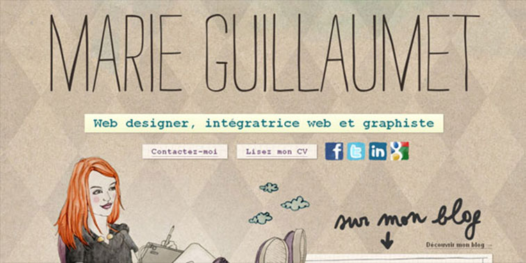
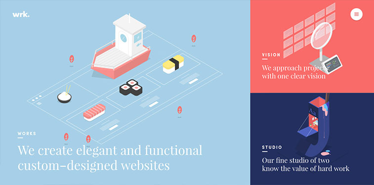
Example:
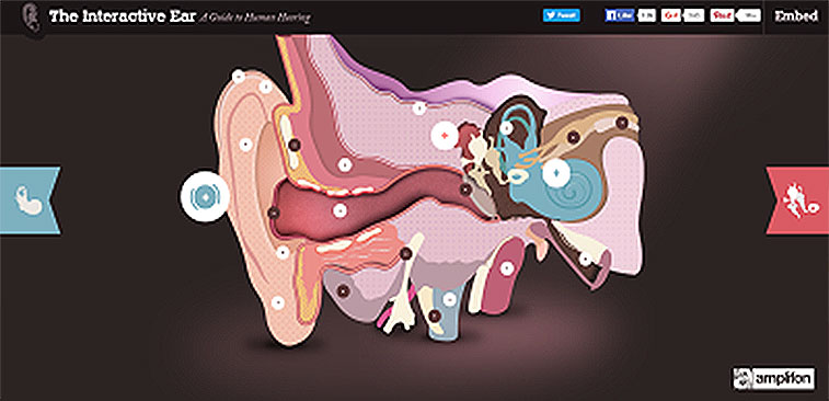
The Interactive Ear is one cool-looking illustrative web design with one big ear illustrated in a detailed manner. As users click on each part, a text will appear on the side explaining what part they clicked on. Relying purely on aesthetics, note how detailed-oriented the design is and how each element flow smoothly altogether as users navigate through the drawings. The overall layout, while simple, is able to illustrate a single concept— the ear.
Illustrative web design allows for a better user experience as it displays a vivid presentation of what your company is all about. However, it is important to note that for this style to work, you will need a compelling design that will coherently work well with your content and that the whole presentation must only employ a single concept.
-
MINIMALIST WEB DESIGN
A minimalist web design is often associated with the “Less is More” concept. Contrary to popular belief, a minimal design does not constitute to a boring design. It only utilizes essential web design elements and removes unnecessary features that would otherwise serve no function throughout the site. It’s all about removing design elements, element by element until nothing else can be removed without limiting the sole purpose of the site.
Often regarded as simple, this type of web design style is straightforward and direct to the point. Its purpose is to make the content stand out and from a visual standpoint, its aim is to bring a calming effect on users by restricting too much imageries.
Simple yet informational, a minimalist design has its own advantages and disadvantages:
Pros:
- A minimalist design allows users to focus more on the site’s information.
- It loads faster as it contains less elements.
- It becomes appealing to the eyes as it exudes cleanliness.
- Users will be able to capture all information from the site because it is so minimal; the contents are easily recognizable.
- Provides easier navigation throughout the site.
- Higher reader retention because the focus in on the content.
Cons:
- It might end up looking cheap or unfinished.
- The overall site might not be able to convey the true message of your company as it can only say so much.
- Designers might be restricted with design elements as a result the overall effect might be lacking.
Example:
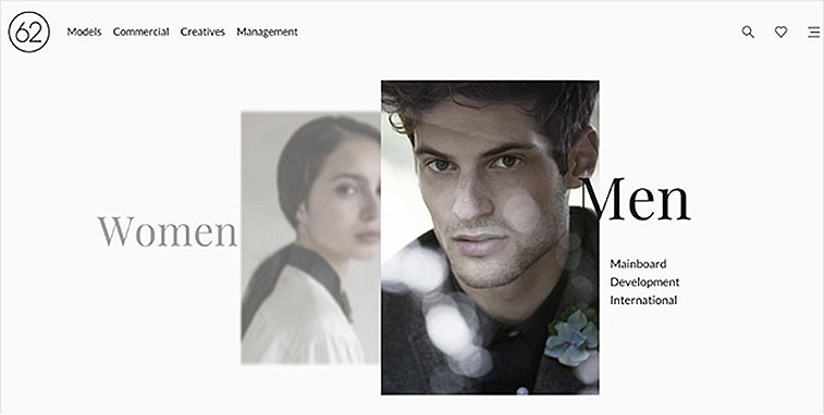
From Webby Awwards, one good example of a minimalist web design is from 62 Models. Note the use of negative space? Negative space is the space around an object. This particular site employs a minimalist design as it only considers the most essential elements that will benefit the site.
While a minimalist web design is great in highlighting your content, before you consider this design style for your company website, make sure your content is compelling. Like all effective web design, compelling content and eye-catching design are essential key elements that make up for a successful site performance.
-
TYPOGRAPHY WEB DESIGN
Although people are visual in nature, online users visit a particular site for a particular information. Users rely on your website content to learn more about you, your products and services. A typography design relies on the aesthetics of your fonts. Font styles such as Helvetica, Impact, Times New Romans, or Comic Sans, all relate to typography.
The key component of this design lies on the readability of your font. You can use this design as creative as you want, but if your fonts aren’t legibly written, users will have a hard time understanding what you want to convey.
This type of design relies on alignment and spacing. You can have a cool looking font, but if each letter is out of balance, one is too big and others are not evenly spaced out, the effect is ineffective; your site performance will fail. It’s also important to note that launching your website with a Lorem Ipsum— placeholder text— can be a turn off. Understand that, users need access to information very quickly. Using a placeholder text can be detrimental to your site.
Pros
- It can be engaging and interactive if used properly.
- It gives your site personality as each typography is based on the designer’s style.
- It can capture users’ attention, especially if beautifully designed.
Like all designs, the result often relies on the end user. If a particular person doesn’t like your finished design, chances are your site won’t be effective. That’s why it’s important to understand your target market.
Cons
- Overused cool-looking fonts might not impact users anymore.
- Improper use of fonts may lead to communication breakdown— designers may lose touch of the objective of the site if he’s too focused on the aesthetics of the font.
- Since the focus is on the content of the site. If content is poorly crafted, your font style won’t matter.
Example:
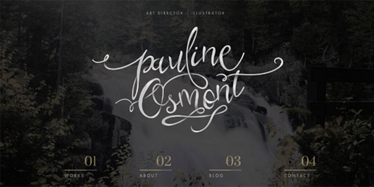
One good example is from Paulione Osmot. Note its unique approach on typography. The curves of each letter are seamless with the overall layout of the design. Furthermore, its alignment and spacing are centered, creating a visually appearing site.
Your typography will determine the flow of your site. Users will form an impression of your site based on the font you use and how it made them feel. Understand, though, that your site won’t be able to speak to all users. Some may prefer cool looking typography design while others may prefer a much more professional design.
-
PARALLAX WEB DESIGN
A parallax scrolling site is focused on a single page where design elements move at different speed rate as you scroll down or sideways throughout the entire site creating an in depth impression of 3D effect. Initially, it was introduced in video games, however, recent technological advancements opened the door for parallax design on web design.
Like all web design techniques, parallax effect has its own pros and cons:
Pros:
- A parallax design is great for storytelling. Because it focuses only on a single page, users can interactively focus on your site just by scrolling down for more information.
- Parallax design is ideal for product unveiling. Because you scroll down for more, you get new information layer by layer.
- Parallax design is effective at holding your visitors’ attention for a much longer time to read on throughout your site.
While these advantages can significantly impact your website performance, it’s important to note that a parallax design will only work if you have a great story concept and design coherent with the overall layout of the website.
Cons:
- Parallax design is not usually favored by SEO. Because of its single page feature, Googlebot will only crawl your site’s information that are easily viewable.
- Parallax is not responsive. Because of its graphics, images, and animations, when viewed on mobile devices, the designs become flat. Today, around 80% of online users view websites on their mobile devices.
- Parallax scrolling slows down your website speed. Because of heavy design elements, it takes a longer period of time to load.
Example:
Parallax Scrolling that tells a story:
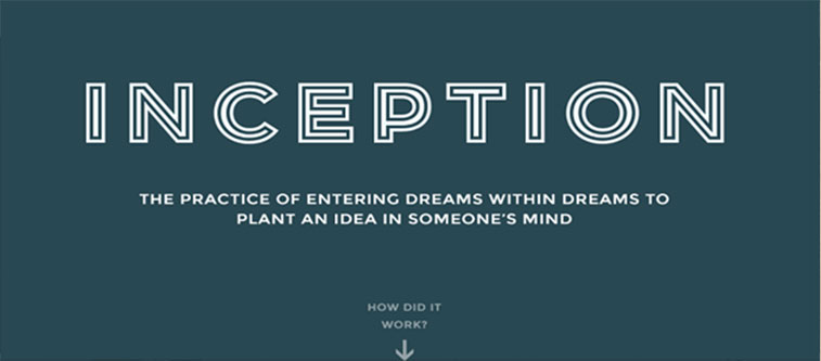
A cool example is a website that explains the story of Inception— a blockbuster film by Christopher Nolan about dreams within dreams. Though it doesn’t narrate the entire film, the purpose of the site is to inform people of how Inception works.
Note how simple the site is but filled with information that seamlessly correlate with each design element—simple arrow lines, and the light colored circles.
Before you choose the parallax design, make sure that:
- You prepare a single concept or storyline that backs what your company is all about.
- Your design elements must make sense. For example, you are in the business of recycling, it’s only fitting if your designs will have trees, plants, and the sun in your designs. Placing an odd element, say a stage where tons of rock artists are playing, will not fit into your website storyline.
- You must take into consideration factors like SEO, website speed, and responsive design.
-
FLAT WEB DESIGN
It’s funny how as technology advances people are becoming more frugal with techniques in design. In the past, designers displayed their skills using flashy animations and vibrant designs, today, however, most designers utilize a simplistic approach to design focusing more on the usability of the site. Often mistaken for a minimalist design, flat design, while it still employs a minimal design, focuses on user interface. Its focus is on website functionality as opposed to visual appearance; the design often becomes minimal, stripped down to a simplistic style focusing mainly on color, icons, and typography. In a simplified definition, a flat design has all design elements lying on a single surface, devoid of three-dimensional feature.
Pros
- In designing, a flat design is easier to convert in responsive design
- Simplistic style can bring ease to users in terms of understanding how to navigate a particular site.
- It strips down unnecessary design elements that would otherwise bring difficulty to user experience.
- Absence of flashy designs and heavy graphics can make the site load faster
Cons
- Mistakes like misalignment, wrong grammar, and spelling are easily noticeable.
- Designers’ creativity in execution may become limited failing to convey the whole message of the company.
- Some sites or apps require a complex design to give a comprehensive navigational guide to users, with a flat design, the website might not be able to capture all complex visual cues.
- The overall design may come too generic because of design element limitations.
Example:
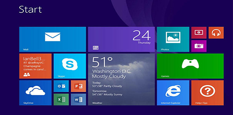
One famous example is from Microsoft Windows 8 interface. Note how the overall design layout falls flat. While it only employs rectangular shape, the interface relies more on the usability that it offers to users.
As business owners, understanding your customers will help you decide whether to utilize a flat design or not. Weigh these pros and cons thoroughly to maximize your company’s potential. Understand that, your website will cater to your target market, not you as the owner. Just because a particular design element appeals to you doesn’t mean your market will appreciate them.
-
MATERIAL WEB DESIGN
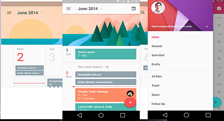
Material web design is somehow the opposite of the flat web design. Developed by Google, it’s a design style that brings back skeumorphism to the Flat web design style. In design, Skeuomorphism imitates the physical world, making the designs close to reality as possible. For example, the iPhone calculator. Note how the design is not far away from how a real calculator looks like.
To better understand this type of design, imagine a simple call to action button. To create urgency it usually utilizes the color red with a compelling text that will elicit a response. In material web design though, it doesn’t end there; the button is animated, making it more appealing and livelier. As defined by Google, Material design is a three-dimensional environment containing light, material, and cast shadows.
One of many new web design styles, this type of design utilizes a number of pros in the world of designers and online users.
Pros
- It’s very detailed and specific as a result users will be able to understand the flow of the site.
- It becomes interactive and engaging because of its three dimensional features.
- It comes with built-in animations easier for designers to utilize.
Although it’s a great contribution in the world of web development, material design is still able to bag a few disadvantages to user experience.
Cons
- Your design may not be unique as it is tied with Google.
- Animations may drain your mobile battery life and may contribute to slow website speed.
- Slows down web development because of animations and heavy aesthetic features.
- Some design elements like buttons might cause confusion for users, whether they can be clickable or with a drop down navigation style.
- It may require users to have a higher version of mobile devices to fully appreciate the design elements such as drop shadows, and color fill. These elements are not hardware-accelerated and to fully appreciate them your equipment must employ a higher specs.
Example:
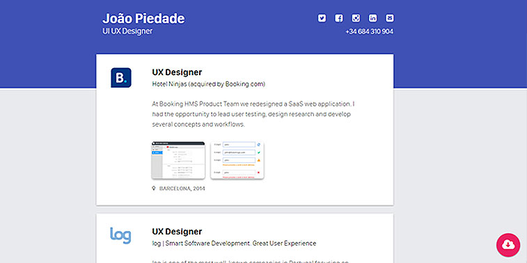
Just by looking at the design, users can immediately associate this website as Material Design. It’s a portfolio design that highlights the work of Joao Piedade. Note the similarity between Google products such as Gmail interface and this website?
It’s important to note that not all websites will perform well on all devices. Some require a higher version of smartphones before you can experience an excellent user experience. Factoring these in your selection of web design style is essential.
In addition, understand that all users have different tastes. Identify your target market and speak directly to them to fully maximize your business potential. Gaining knowledge of these different web design styles will help you decide which type to utilize for your company website. Factor in all the pros and cons of each style to fully determine which will best fit your company profile, identity, and brand.
What other web design styles do you think business website can consider? What other web design tips you can give business owners to improve their online presence? Comment your thoughts and suggestion below!