10 Homepage Elements Every Website Should Have
The home page is the first thing online visitors see when they visit a website. It is a well-known fact that a home page is one of the most important pages of a website. Your home page is an invitation to your online readers. It’s a showcase of your company’s potential in the marketplace. It will serve as the showroom of your company.
Remember, first impression lasts. If a user visits your site and is not convinced with your home page, he will hit the back button and leave your site right away (if you are using Google Analytics, this is known as Bounce Rate). You have a few seconds to retain your visitors before they hit the back button. Your home page is your online ticket to success. If your page is able to attract a visitor online, chances are the person will browse through the rest of your site.
The home page is where your visitors get converted into potential clients. But if you have a distasteful home page layout that lacks important elements, soon your online visitors will leave your site as quickly as possible within seconds.
An effective home page must retain visitors to browse through the rest of the site, must elicit an action from online readers, and must convert online visitors into potential clients and prospects.
Equip your website with these important homepage elements to attract your online visitors’ attention:
- Compelling Headline

In websites, headline sets the overall tone and purpose of a specific web page. Usually, written in big bold letters, the headline is the online visitors’ cue whether to stay and browse through the rest of the site or hit the back button and leave.
Creating a compelling headline will attract your visitors to read more about your company. Not only will you entice them, you will also create an itch for them to learn more about you, your products and your services. Using a creative headline, you can pique your visitors’ curiosity leading them to browse through your entire website and not only your home page.
Your headline’s goal is to reel them in and capture their attention. No matter how good your products and services are, if you don’t know your visitors’ language, no one will read through your site. Perhaps they’ll peruse through it, but no one will really be interested. With a compelling headline, you are showing them a sneak peek behind the wonders of your company.
- Strong Value Proposition

People have the mentality of “what’s in it for me?” And right away they’ll see through your lies and false promises. Crafting a strong value proposition will capture your online visitors’ needs, especially if they view your proposition as a solution to their problems.
Transparency is always a good thing in business. By clearly laying out your company’s promise to the market, you give your online visitors answers to their needs.
Openly discuss in your home page the gist of your company’s value proposition. List down creatively each promise your company intend to dish out in the market. Clearly state your position in the market, addressing the problems of the people. Show them that you are here to offer them solutions to their problems. They already clicked on to check out your website, make sure that your home page is equipped with a strong promise that answers to your market’s needs.
- Benefits and Features

When online visitors visit a website, they expect the home page to give them details of the company’s products and services. List down the benefits and features of your products and services in an organized manner.
Remember, people visit a particular site for a reason. Your benefits and features must appeal to their needs. By displaying various advantages of your solutions to the market’s problem, you can attract them to read on through your site.
With your competitors offering the same thing in the marketplace, your company must stand out and offer rare and unique solutions to the market. Highlight your products and services’ features and benefits to attract more of your online visitors.
- User-Friendly Navigation Menus

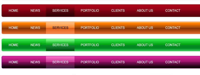
When developing a website, it must be equipped with user-friendly navigation buttons. Navigation menus allow people to browse through your entire site when they want to learn more about your company, products, and services. Having the correct placement of each button— contact us, help, products, services— will create an excellent user experience. Having the wrong placement, on the other hand, will quickly drive them out of your website. These buttons will serve as a guide for your readers to navigate through the entire site. If they can’t simple understand them and don’t know where to look for them, they will leave your site.
- Supporting Images

Most people are visual thinkers. Their brains function much better when words are accompanied with engaging photos. Use creative images that will work well with your home page layout to support your contents. Without images, chunks of paragraphs from your content will easily scare your online visitors. Pique your visitors’ interest by applying appropriate photos together with your compelling contents. Equip your home page with this combination to tap your visitors’ attention. Creative visual presentation will increase the chance of your visitors staying in your site. Not only will they browse through your home page, they will also certainly browse through the rest of your site to look for more engaging photos and interactive animations.
- Links to your Social Media Sites

Companies interact with their customers not only through their website but also through their social media sites. Social media sites like Facebook, Instagram, and Twitter are used by most companies to showcase and display their products and services, their achievements and milestones, as well as their various activities in the marketplace. By linking your social media to your home page, you allow your social media fans and website visitors to see more of your company. Because most people are on social media nowadays, by equipping your home page with this social links, it becomes easier for people online to share your contents across the internet. With these links, you’ll increase your website traffic as well as your fan base by being visible all over the internet. Here are some social media sites that can help boost your online presence.
- Client Testimonials

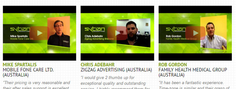
Before we can trust a company, we usually ask for a second opinion or visit review sites. Because we rely so much on what other people say about something, we become extra cautious about information we search online. Customers will always look for proof that what you are claiming is the truth. By displaying an array of your clients’ testimonials in your home page, you can eliminate most doubts of your online visitors. In this way, they feel more secure and safe about your company. By showing them that other people can vouch for your excellent services you create a sense of trust and reliability with your visitors. Creating video testimonials or putting testimonials from credible websites like TripAdvisor will greatly increase your credibility.
- Engaging Calls-to-Action

Content is useless if it doesn’t elicit an action from your online visitors. You want them to either subscribe to your monthly newsletter, to register and create an account from your site, to sign up to your services, and most importantly to purchase your products. Call to action buttons can determine whether an online visitor will purchase a product of yours, or try a service from your company. Provide interactive call to action buttons in your contents and increase exposure for your products and services. Make sure to equip your home page with engaging calls-to-action to draw response from your online visitors.
- Awards and Recognition

Again, people need assurance that you are the best in the industry. With your awards and recognition displayed in your home page, you can gain your online visitors’ confidence in you. Customer proof carries a lot of weight but awards make the difference in the marketplace. When your company is recognized by huge agencies, your credibility in the marketplace increases. Make sure to display your collection of awards and recognition in your home page.
- Interactive Web Design Layout

Without an interactive home page layout, your online visitors will immediately hit the back button and leave your site. Creating an excellent user experience is your number one goal when designing a home page. Make sure to use color combinations that balance each other out. Your home page alignments and measurements must be checked as well making sure that each design element cohesively match tiny details of your home page. Lastly, the overall design, together with these nine elements must perfectly work altogether. Make sure that your website is mobile and tablet friendly as well!
The home page is one of the most important parts of a website. Because first impression lasts, any unpleasant detail present in this page can reduce the chances of your online visitors staying in your site and browse other web pages. It is important to equip this page with these ten elements to ensure a maximum exposure for your company, products, and services.
Fortify your home page with a compelling headline, a strong customer value proposition, your products and services’ benefits and features, client testimonials, awards and recognition, and engaging calls-to action to fully showcase your company’s potential online.
Do you have any other significant home page elements to add in this article? Write your comments and suggestions below!