10 Examples of Travel Websites to Get Inspiration From
Summer might be over but that does not mean you cannot travel for the rest of the year. Pack your bags because we are going on a trip! This is how an inspiring travel website should make its visitors feel, it must awaken the wanderlust in them.
Now, how does a travel website attracts and inspires visitors to book a trip? Both web development and designs play a huge role in creating an excellent first impression for a business. In addition to this, 94% of visitors mistrust a website due to design-related reasons — this is according to a study reported by Rocket Media.
Trust is essential because of the significant investments put into planning for a trip. This can make or break a traveler’s decision to go on a trip or a vacation in a city and choosing the place to stay. Excellent travel websites should also give enough information needed so their visitors can arrange their next travel plans.
Fortunately, there are numerous travel websites that you can use as an inspiration to create your own and come up with a visually appealing and functional site.
Here are 10 examples of travel websites to get your inspiration from:
1.Visit Brazil
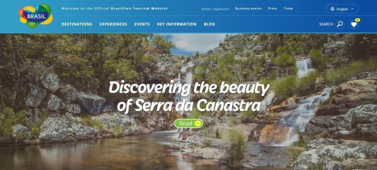
Visit Brazil is the country’s official tourism website. Looking at it, you might simply think that developing the site took an easy process because it’s not that difficult to entice travelers to visit a country that makes up almost half of South America’s continent — with diverse culture and vibrant places to see. However, the travel website made sure to cover as much information as needed for a traveler to know about the country.
The website offers key information that travelers need to know before they book a flight. This information includes health, security, visa and documents, emergency numbers, electricity, weather, telecommunications, language, and other important links about the country.
2. On The Grid
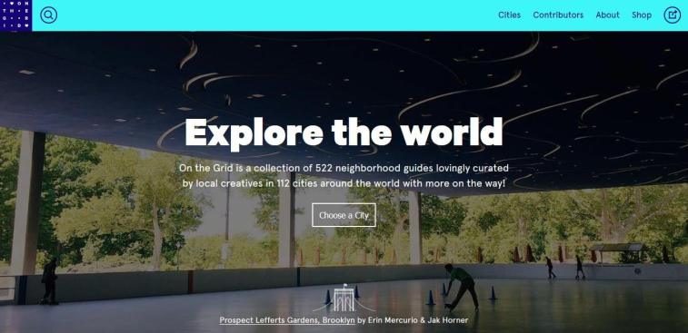
On The Grid is a travel blog that covers numerous countries and continents. This travel website requires a different organization — instead of visitors jumping right into hotel and events information, the site’s main navigation bar is organized by region.
While its homepage features an A-Z list of city guides that runs from Aberdeen to Zurich. Pretty cool huh?
3. Visit Australia
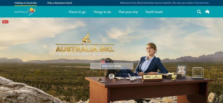
Visit Australia, the “Land Down Under’s” official tourism website made sure that it showcases the country through eye-catching photos and allowing visitors to plan a business event.
The travel website encourages visitors to learn more about Australia’s specific regions and lets them determine which best suits their tastes. It also gives information about different travel essentials like facts and planning; FAQs for its visa, customs, and quarantine; and exploring the country by map.
4. Live Africa
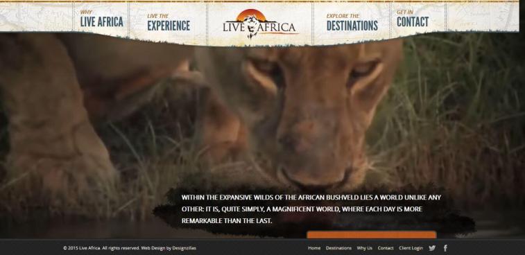
Live Africa is the official tourism website for the entire continent which plays a huge role by giving the exact feeling and experience for the travelers. It shows the essence of the African safari that the travel website promotes.
For the website design, you’ll notice the textures and colors used reflecting the African safari. Videos of majestic animal roaming the wild kingdom are also shown on its landing page, showing what visitors would see if they go for a trip to Africa.
5. The Hawaiian Islands
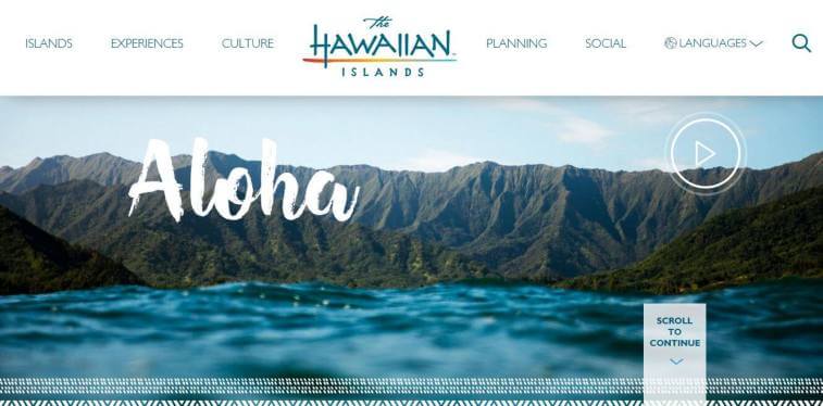
Aloha! The Hawaiian Islands’ travel website is an excellent example of a “clean and crisp” site design. Yes, it may look like an average travel website — featuring a Hawaii’s scenic landscape, travelers enjoying a day kayaking, and exciting videos of the fun activities to do while there. But taking a closer look at the website gives you that serene feeling and vibe because of its simple design and website colors that calm your mind.
6. Egypt Tourism Authority
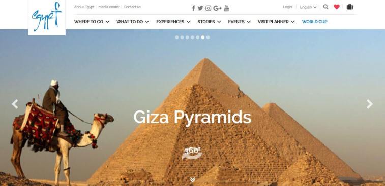
Egypt Tourism Authority’s travel website does an amazing job of promoting various types of experiences and trips that travelers can enjoy. The website is designed to highlight the country’s culture, with a 360 view of stunning landscapes and Giza’s pyramids. It also shows beaches and deserts tempting visitors to proceed with their travel plans.
The information presented on the travel website is excellent as well! From places to go, events, experiences, stories, to a visit planner which is essential for travelers.
7. Discover Chile
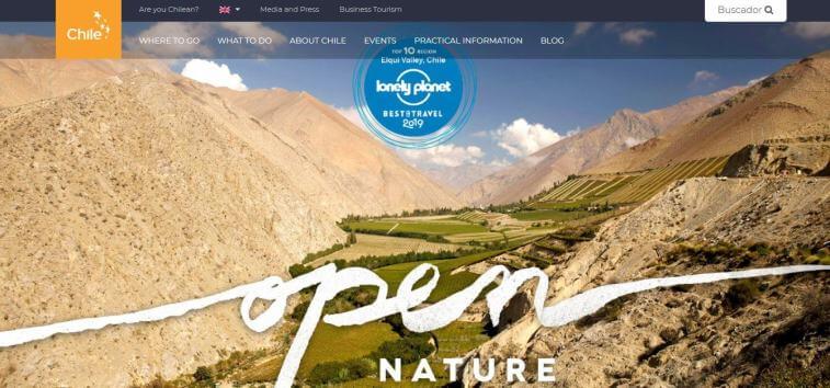
Here’s Chile’s official tourism website, Discover Chile. The first thing visitors would notice on this travel website are the stunning images of its landscapes and travelers enjoying nature’s serene beauty.
The travel website also shows its awards and badges from the lonely planet, The National Geographic, and World Traveler Awards — these are essential factors to increase visitor trust.
8. Toucan Cafe & Tours
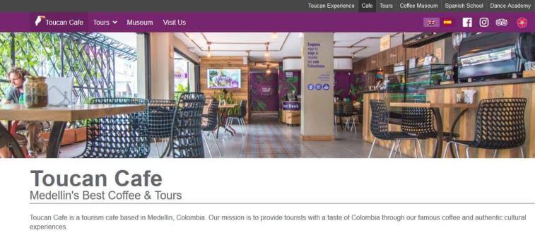
Toucan Cafe & Tours is a Medellin coffee shop that offers languages and tours exchanges. Its travel website is excellently comprehensive that features various types of tours and details about its cafe.
The travel website also showcases museum tours, a visit to Columbia’s authentic coffee farm, and coffee workshops — these activities would sound amazing for coffee lovers who are also wanderlusts!
There is also language exchanges where expats, tourists, and locals come together to practice speaking and conversing in English and Spanish, this is a wonderful way of meeting people from diverse cultures.
9. Cookiesound
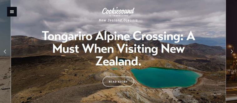
Cookiesound is a travel blog that features personal stories from a mother-daughter photographer team — their travel photography captures unique experiences, showing what they love to do most.
The mother-daughter tandem has made a name for themselves in travel photography by taking photos across the globe and their travel website shows a compilation of their wonderful journeys.
Along with these stunning photos are equally amazing stories behind it — making this travel website attractive and informative.
10. Outlines
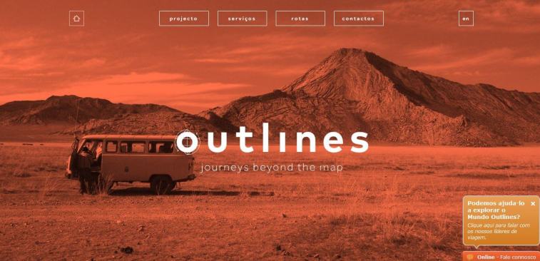
Outlines is a unique travel website that offers visitors journeys beyond the map. The site offers tours to Route 66, a road trip to Croatia, Burma, India, Guatemala, a road trip to Mongolia, Nicaragua, Italy – Amalfi Coast in Vespa, and Cuba’s Havana, Santiago, and Sierra Maestra, and so much more!
Its design is attractive to those who seek a different kind of adventure that goes beyond the scenery of ordinary tourist spots by letting you experience road trips like never before.
There is no specific travel website development guide but these inspirations are more than enough to cover a variety of approach, design, and styles to get inspiration from. However, you must always keep in mind to keep your travel website’s navigation functional and simple — then you can never go wrong.